Conversion rate up 86%. A data-led rebuild for AuraSun that sells like the brand it became.
Designed in 5 weeks, AuraSun's data-led rebuild lifted conversion rate 86% in the 60 days after launch, all around how customers actually buy.
Services
- UX/UI design
- Conversion optimisation
- UX research
- Analytics & tracking
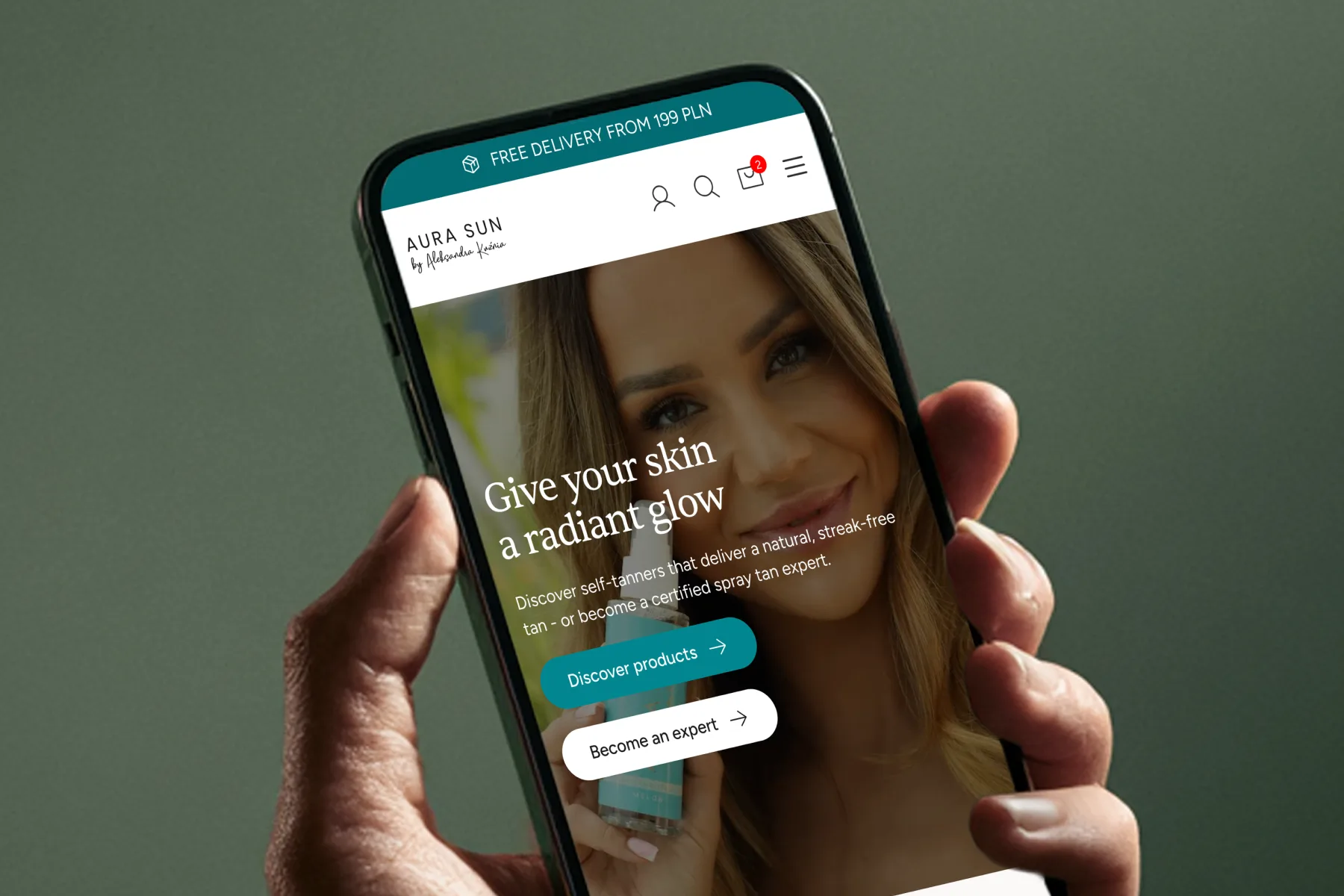
- Conversion rate
- +86%
- Mobile conversion
- +94%
2.47% → 4.59%
2.30% → 4.47%
60 days post-launch · measured in GA4 · conversion rate, the signal that ignores how much traffic came
The brand grew up. The website stayed in 2016.
You know the feeling. Your brand grows up: new packaging, better photography, a spot on premium shelves, an award on the wall. Then you open your own website and it looks like it's still stuck in 2016.
That was AuraSun, a Polish self-tanning brand on the shelves of premium beauty chains like Douglas, Hebe and Super-Pharm, with a loyal following that comes back a few times a year. On the shelf: premium. Online: a store that took over five seconds to load on mobile and went completely quiet at the exact moment a customer was ready to pay.
94% of customers shopped on mobile. So a slow site and a checkout that hid basic delivery info until the final step was money walking out the door every single day.
The brief was simple and honest: make the store look like the brand it had become, and sell better if you can.
There were no heatmaps, no session recordings, nothing to watch. Just GA4 and a few hundred customer reviews. That is all I need. I don't guess where a store leaks. I read the data and the words customers already wrote.
Where the store was losing sales
Four leaks were quietly costing sales. None of them were about how the site looked.
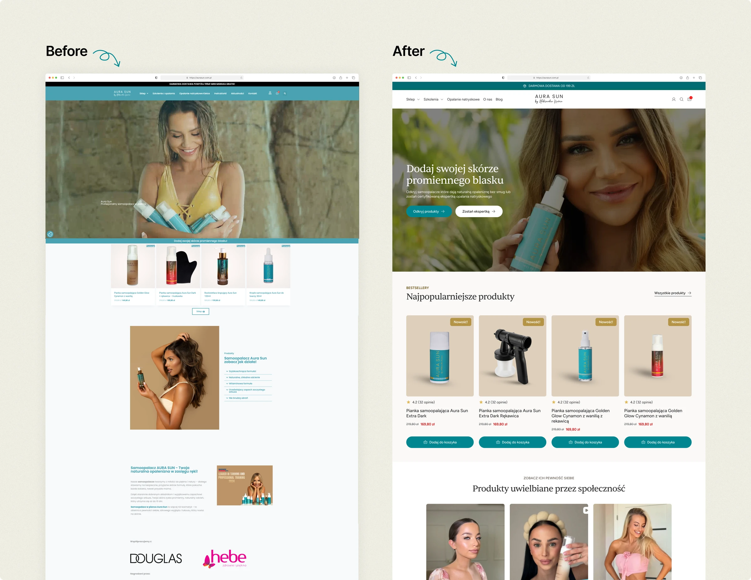
The homepage was selling three businesses to one confused customer
A woman lands from Instagram, ready to buy self-tanner, and the homepage hits her with a product shop, professional training courses, and a local salon all at once, with no clear path to any of them. Most of the page was training content built for Google, not for her.
What I did: Cut about 60% of the homepage and put two clear choices in the hero, “Shop products” and “Become a spray-tan pro.” Within three seconds, a visitor knows where they are and where to go.
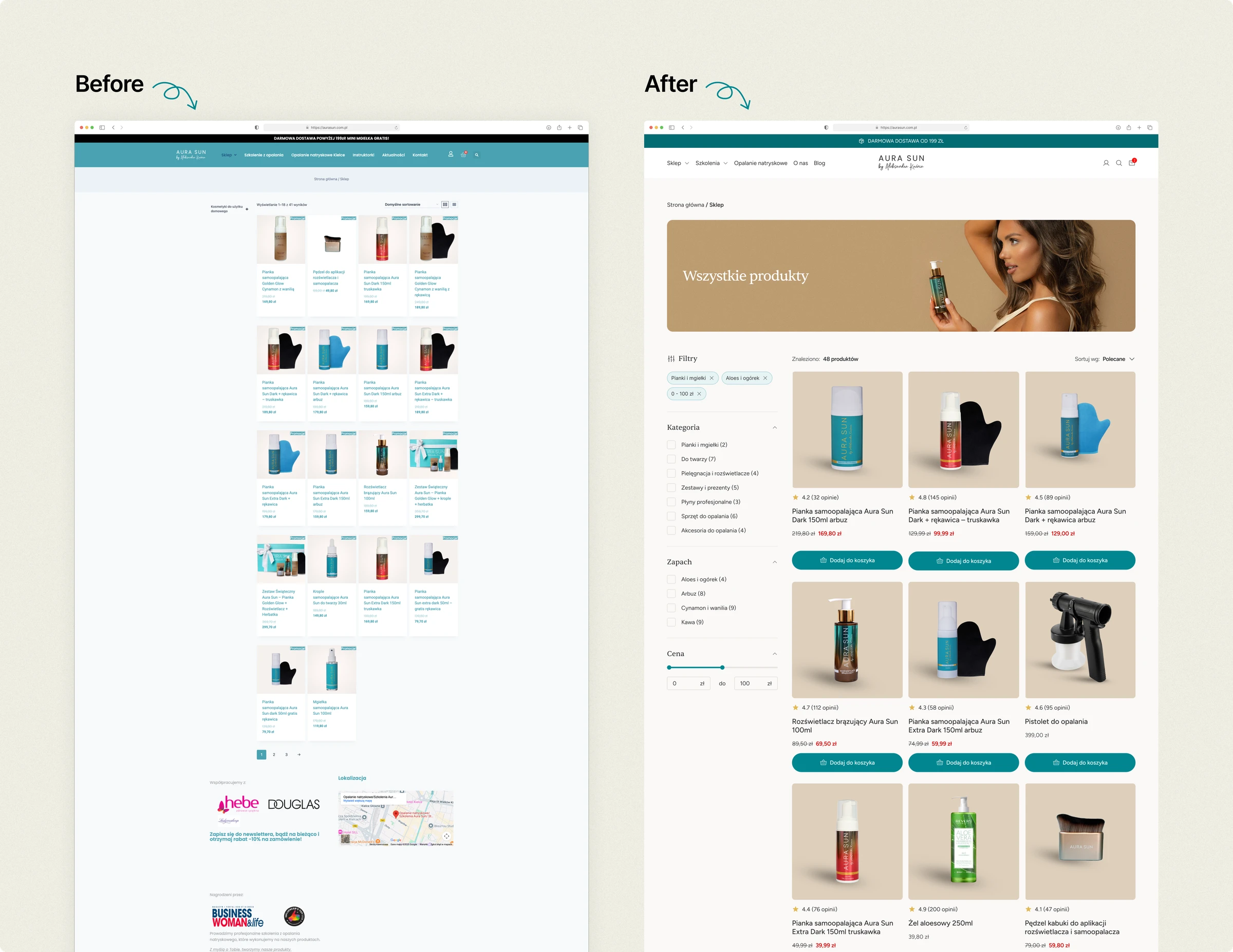
Half the “add to cart” clicks came from a page with no reviews
Nearly half of all add-to-cart clicks came straight from the product list, not the product page. These were customers who already knew the brand and didn't want to click through. But those list cards showed no ratings, no reviews, no scent. The list was asking loyal customers to buy on faith.
What I did: Rebuilt the list cards to carry the proof, right where the decision was already happening. Star ratings, review counts, the one detail that closes the sale.
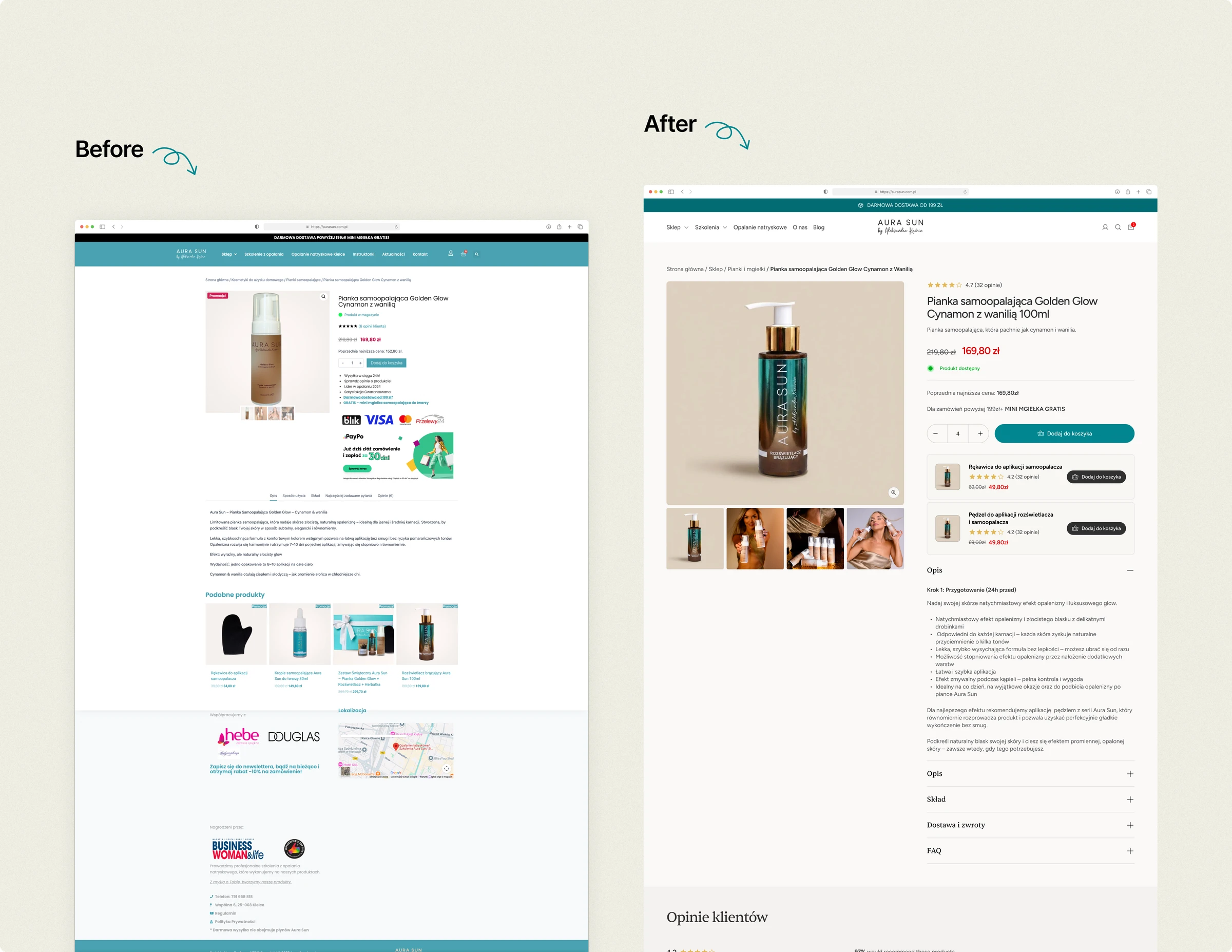
The #1 reason people bought was invisible
I read hundreds of customer reviews. One thing came up more than results, more than price, more than anything: the scent. Over 30% mentioned it, unprompted. And it appeared nowhere above the fold.
What I did: Rebuilt the product page to lead with scent as the hero benefit, and answered the three fears that stop people buying (orange tone, staining, bad smell) before they had to ask. Then added a “complete your routine” cross-sell under the button to lift order value.
The checkout went quiet at the moment of payment
Customers reached checkout ready to buy, then couldn't see how their order would ship. InPost, Poland's most popular delivery method, stayed hidden until after they had typed in their address. In the data, mobile users were visibly restarting checkout rather than finishing it.
What I designed: Delivery options and the free-shipping threshold surfaced before the address step, plus a cart drawer with a progress bar toward free shipping.
What shipped: The free-shipping threshold and the delivery and payment icons, on the full cart page. The rest needed custom theme code that was outside scope, and I found that out after the designs were done. It is the one thing I would change about this project: agree with the developer on what the theme actually supports in week one, before drawing anything.
Recognise one of these on your own store? That is usually where I start.
Seeifwe'reafit
For every 100 visitors, nearly twice as many bought.
| Metric | Before | After | Change |
|---|---|---|---|
| Conversion rate | 2.47% | 4.59% | +86% |
| Mobile conversion | 2.30% | 4.47% | +94% |
| Desktop conversion | 5.1% | 7.6% | +49% |
| Checkout completion | 36% | ~75% | doubled |
Here is the part that matters. Traffic grew too, partly the season, partly the brand. But conversion rate does not count heads at the door. It measures how well the store turns whoever arrives into a buyer. Even if the same visitors had come as before, nearly twice as many would have bought.
Was some of that the spring season and the Easter promo? Some of it, honestly, yes. I can't split the redesign from the calendar to the decimal, and I won't pretend to.
Two more things I won't dress up. Checkout completion doubled, and that one is not my fix, because the checkout was never rebuilt. The most likely explanation is speed: the new build loads in a fraction of the time, so fewer people gave up mid-payment. And two steps of the funnel got worse. Product page to add-to-cart fell about 17%, and add-to-cart to checkout fell 15%, the second one a direct consequence of the cart drawer never shipping.
But the store stopped going quiet at the moment of decision. It started selling while she slept, and finally looked like the brand she had spent years building.
Here is how the founder put it

“60 days after launch, my store's conversion rate was up 86% and checkout completion had more than doubled, from 36% to nearly 75%. I came to Igor because I wanted a store that sold, not just one that looked pretty. He started with the data, found exactly where I was losing customers, and fixed it. Honest the whole way, no promises of miracles, just measurable results.”
 Aleksandra KuźniaFounder, AuraSun
Round two starts where round one fell short.
The cart drawer that never shipped is first in line, along with the two funnel steps it cost. After that, a win-back flow for a product people finish and rebuy. With tracking finally in place, both are measurable from day one. Round one moved the number. Round two goes after what it could not reach.
Your brand outgrew your website?
“I wanted a store that sold, not just one that looked pretty. He found exactly where I was losing customers and fixed it.”
That is exactly the gap I close: the store that sells like the brand you have become.
Seeifwe'reafit
A few questions about your store. Your number lands in your inbox by tomorrow. No pitch.
AuraSun is a live client project. All metrics are GA4 data from the 60 days following launch and reflect a team result: design, development, and the client working together. My contribution was research, architecture, and design.