The overview
I designed a full e-commerce experience for a luxury botanical brand, exploring how skin-type-first navigation and trust signals at key decision points can justify $150–200 price points. Every product image was generated with Midjourney using a production-level prompting workflow - no photography budget, no stock photos, no compromises on quality.
Three design decisions
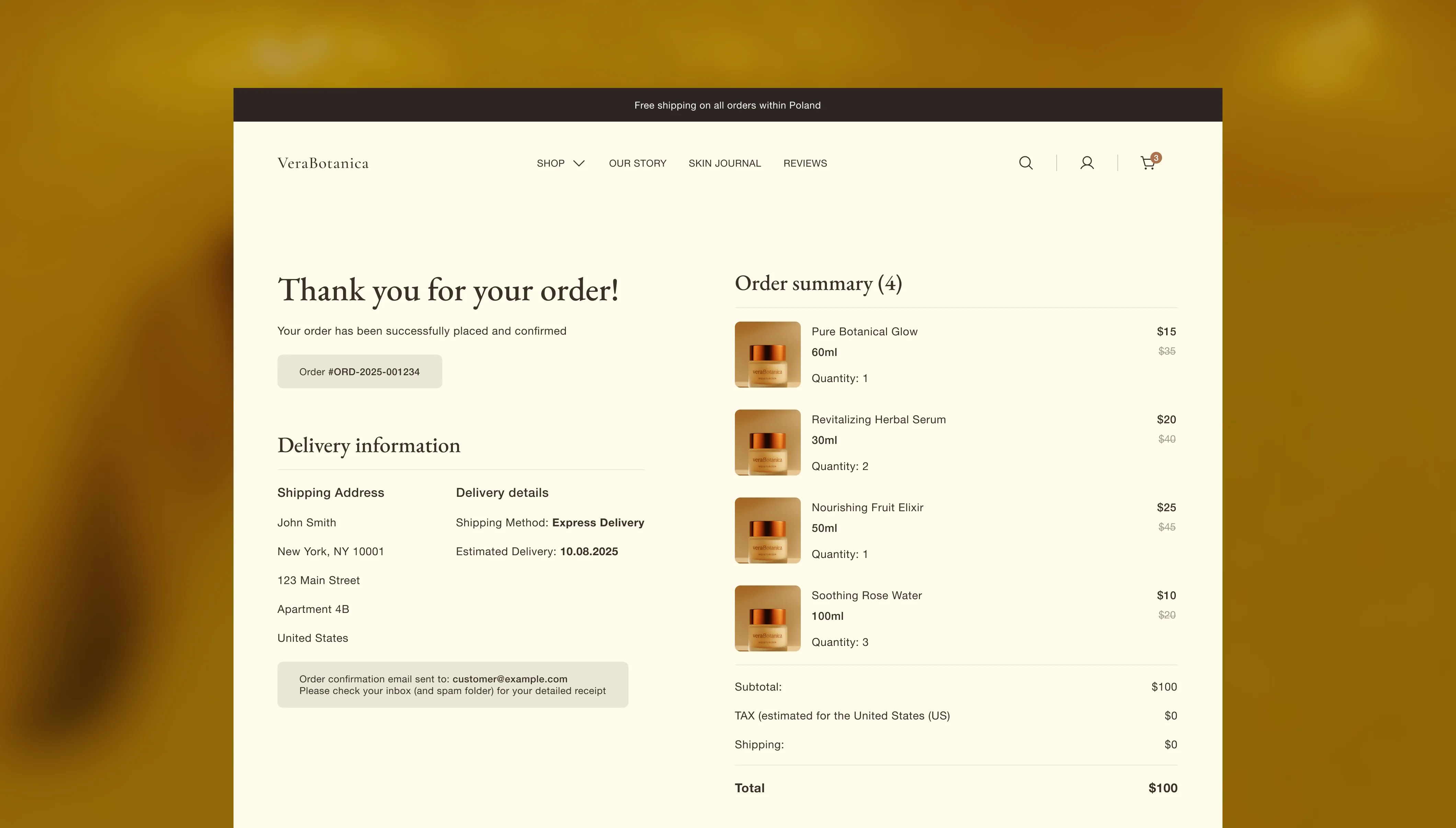
This project was driven by one question: what makes someone comfortable spending $180 on a serum from a brand they've never heard of? Every page in the journey has a job - the homepage builds credibility, the category page helps you find your match, the product page justifies the price, and the cart removes reasons to hesitate.

Horizontal Skin-Type filters on category pages
Category pages use standard product-type navigation - moisturizers, serums, cleansers. But once a customer lands in a category, the next question isn't "sort by price" - it's "which of these is right for my skin?" I added horizontal filters by skin type at the top of the product grid, letting users narrow results in one tap without leaving the page. It's a small interaction pattern that shifts the experience from browsing a catalog to getting a recommendation.

Trust signals where hesitation happens
At $48–180 price points, customers need reassurance before they click "Add to Cart." I placed four trust badges directly below the cart button - visible without scrolling, exactly where hesitation happens. For deeper product knowledge, I used accordion sections. This keeps the page clean for quick buyers while giving cautious customers a way to dig deeper without leaving. "Botanical Origins" and "Application Ritual" aren't standard e-commerce patterns - they're borrowed from luxury brand storytelling to reinforce that this isn't just another moisturizer.

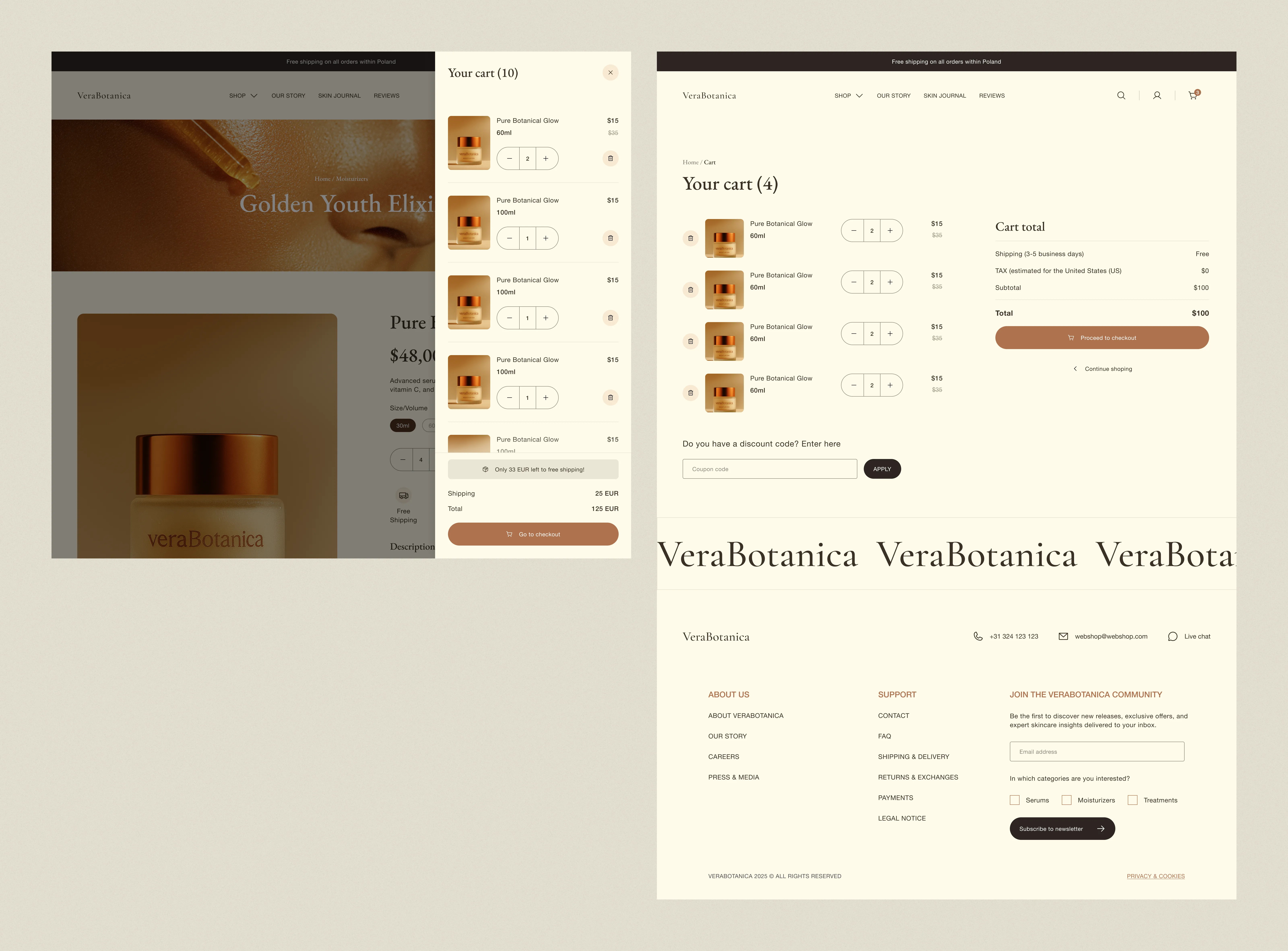
Two-Step cart - Drawer for momentum, Full Page for commitment
Instead of one cart experience, I designed two. The slide-out cart drawer appears immediately after adding a product. It's designed for momentum: don't interrupt the flow, give a reason to add more. The full cart page serves a different purpose - it's where committed buyers review everything - itemized costs, shipping and VAT breakdown, and a discount code field. Two different mental states, two different interfaces.

AI asset pipeline - Midjourney to brand system
All product imagery was generated with Midjourney. Not as a shortcut - as a deliberate production workflow.
- Started with 3–4 reference images to lock the aesthetic: lighting quality, color temperature, botanical-meets-clinical mood.
- Built prompts with camera specs - lens type, focal length, lighting setup. Generic prompts produce generic results. Technical prompts produce controllable, commercial-quality output.
- Used one strong output as style reference for all subsequent generations. This is what creates visual consistency across a product line - without it, every image looks like a different photographer shot it.
- Exported to ChatGPT image generation for label typography. Midjourney struggles with text; knowing which tool handles which task is part of the craft.
What I'd test
If this were a real product, here's what I'd validate first:
- Is ingredient story above the fold more effective than leading with social proof?
- How does the full journey hold up on mobile, where luxury skincare discovery skews heavily?
Thanks for reading
Want to discuss e-commerce UX or AI-generated brand assets?

VeraBotanica is a concept project. Brand, products, and pricing are fictional. The strategic thinking, UX decisions, and AI asset workflow are real and reflect how I approach luxury e-commerce design.
