AuraSun. A store redesign that lifted conversion by 86% in 60 days
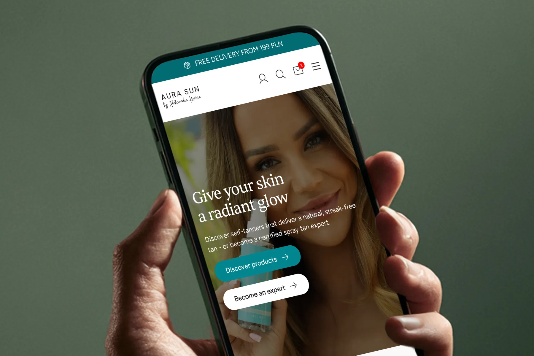
The brand looked premium on a drugstore shelf and several years out of date on a phone, where 94% of its orders came from. The redesign put the product first and the proof where customers decide.
Client
- AuraSun
Services
- UX/UI design, Conversion optimisation, Analytics & tracking
Live site
- aurasun.com.pl
Conversion
- +86%
- 2.47% → 4.59%
Mobile conversion
- +94%
- 2.30% → 4.47%
The premise
Redesign and CRO of a store for a Polish self-tanning brand, built on its analytics and its customers' reviews.
[01]
Overview
AuraSun is a Polish self-tanning brand, stocked by Douglas, Hebe and Super-Pharm. It's a product that runs out, so customers come back for another bottle several times a year.
My job was the redesign and conversion optimisation of its WooCommerce store, over five weeks, while the client's own developer built it in parallel. The brief was short: make the store look like the brand the company has become. And make it sell better, if you can.
[02]
The challenge
New packaging, better photography, an award on the wall: the brand looked premium on a drugstore shelf and several years out of date on a phone. And 94% of purchases came from a phone.
The store was losing sales every day, because
- it took over five seconds to load on a phone
- the layout fell apart on mobile: wrong sizes, wrong spacing, elements that didn't appear at all
- the homepage sold three businesses to one customer: the store, professional training and a local salon
- the basic selling mechanics were missing: no cross-sell, no upsell, no free-shipping threshold
A customer arriving from Instagram, ready to buy a self-tanner, had to get past all of that first.
[03]
Starting with the data
Before designing a single screen, I wanted to know where people drop off and which screens they actually buy from.
In the first week I went through
- GA4 with e-commerce events, screen by screen and step by step
- a matrix of reviews: the brand's own, Google's and its competitors', the best and the worst
- what customers complain about, what worries them and what they praise
Two findings changed the plan. Almost half of all add-to-carts came straight from the product listing, skipping the product page. And over 30% of reviews mentioned the scent unprompted, more often than results or price.
[04]
A homepage for one customer
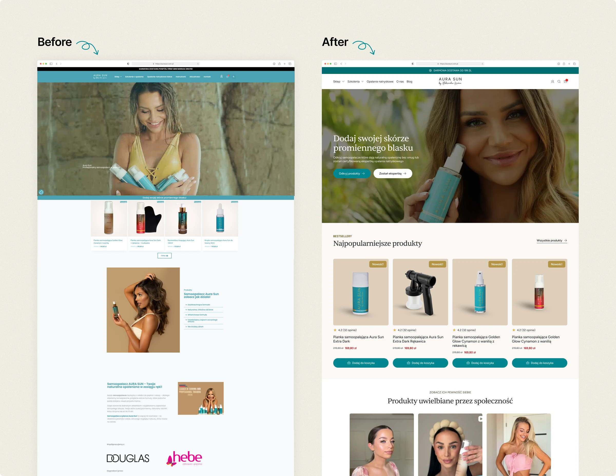
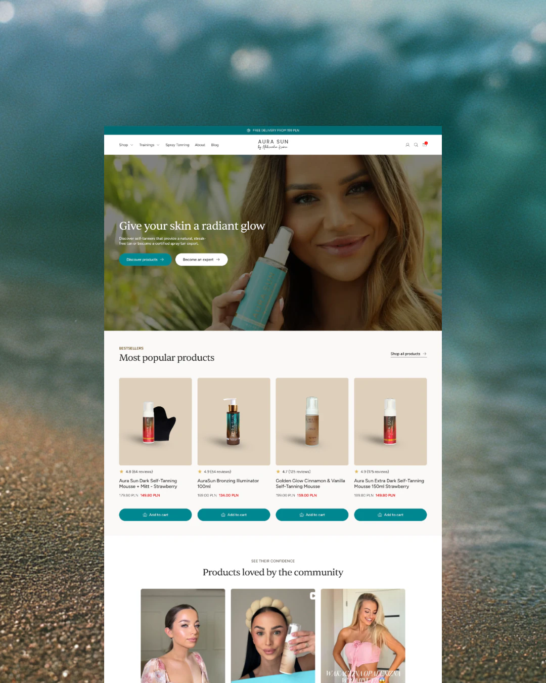
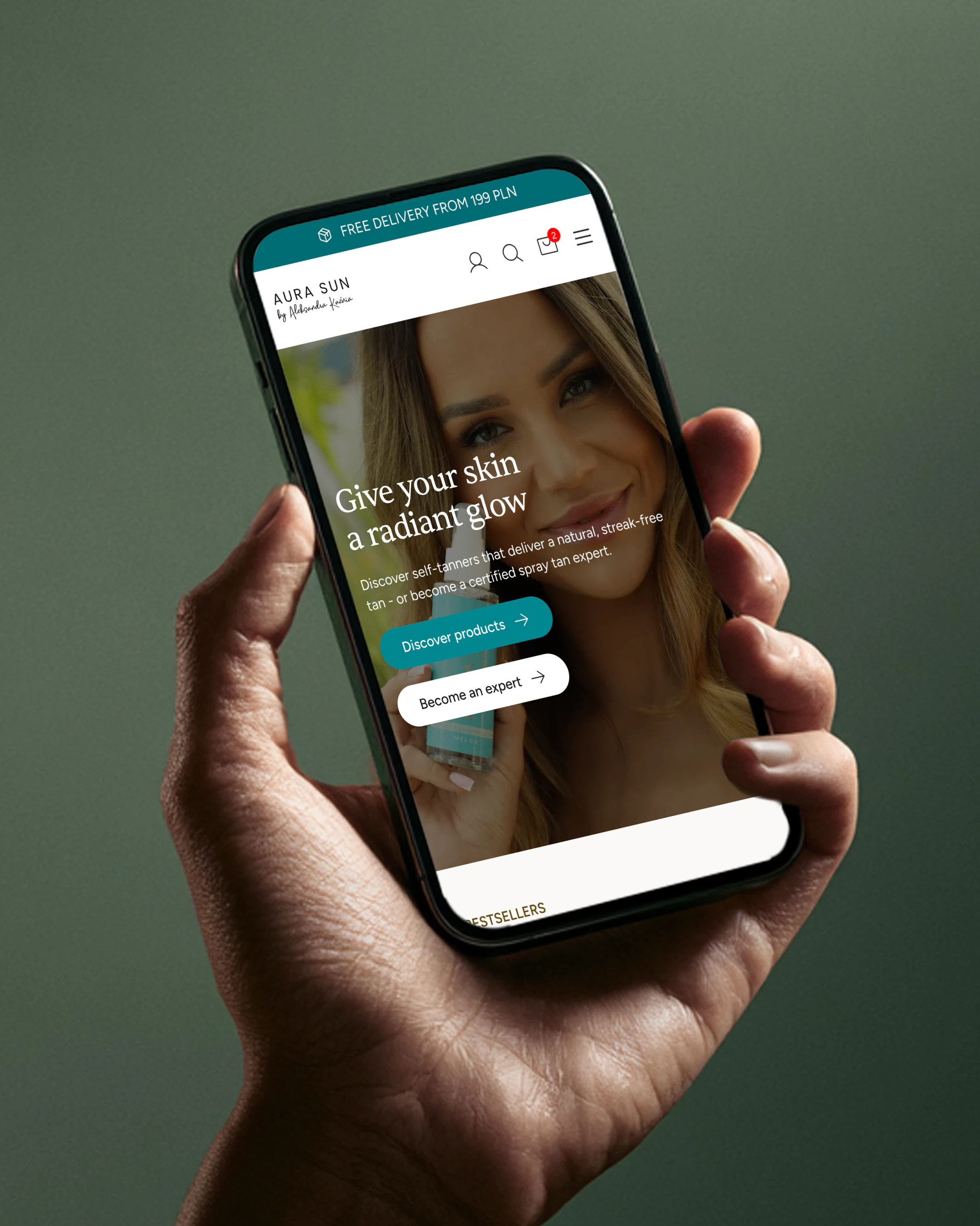
Most of the old homepage was written for Google, not for the customer. The new one is around 60% shorter.
The new homepage
- leads with the product, not with three businesses at once
- keeps two choices in the hero: “Shop the products” and “Become a spray tan specialist”
- shows the bestsellers with their ratings and prices straight away
[05]
Proof where the decision is made
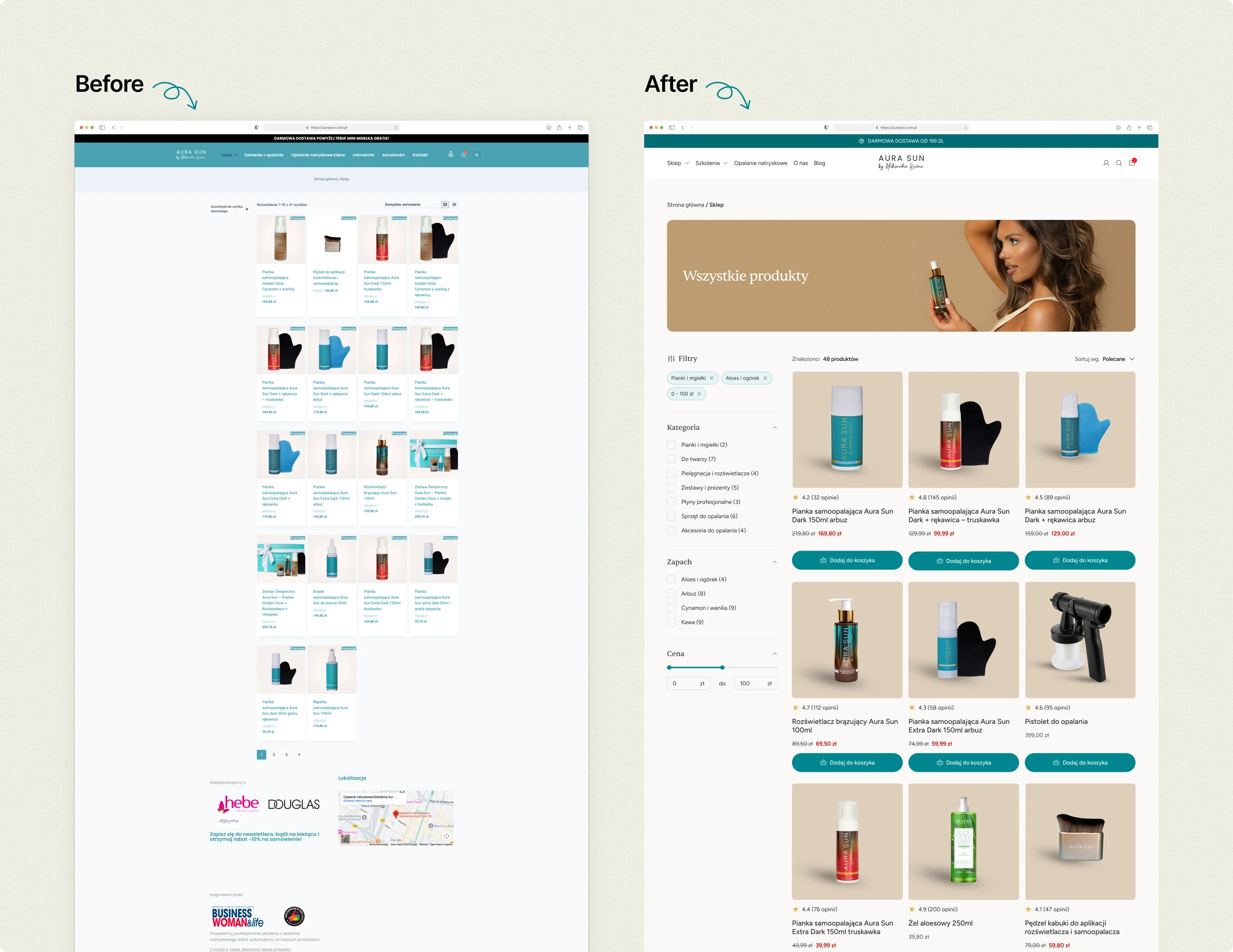
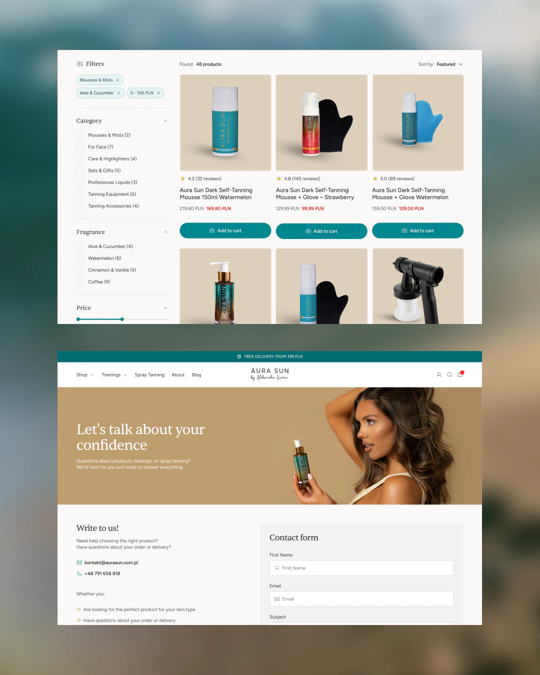
The listing was asking loyal customers to buy on faith. Its tiles showed no ratings, no reviews and no scent, on the very page where almost half of add-to-carts happened.
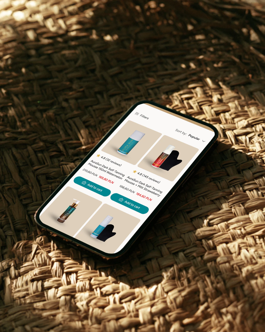
Each tile now carries
- the rating
- the review count
- the scent
- an add-to-cart button, so the purchase can still happen right there
[06]
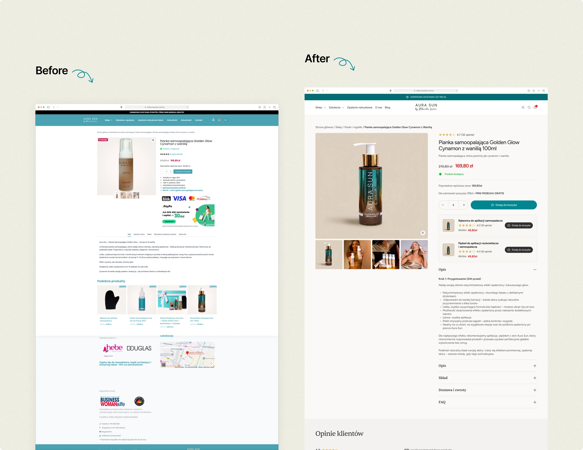
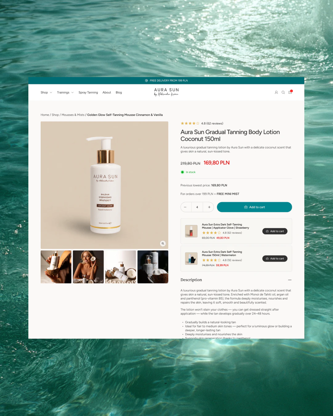
A product page that answers the worries
The product page leads with the scent as the main benefit. It names it in the title, on the first screen, without scrolling, where the old version buried it under the payment badges.
Right below, it answers the three worries that hold a purchase back
- an orange tone
- stained clothes
- an unpleasant smell
A “finish your routine” cross-sell sits below the buy button.
[07]
The cart, and working with the developer
I designed the cart with the delivery options and the free-shipping threshold ahead of the address step, and a drawer with a progress bar.
Halfway through, it turned out the template couldn't support the drawer or moving the delivery options without changes to the code, which was out of scope. What shipped was the free-shipping threshold, plus the delivery and payment icons on the full cart page.
It's the one thing I'd do differently: agree with the developer in week one what the template actually supports, before anything gets designed.
[08]
The result
60 days after launch, conversion went from 2.47% to 4.59%, up 86%. On mobile, where it was worst, from 2.30% to 4.47%, up 94%. Measured in GA4.
The store
- speaks to the one customer who comes to buy a self-tanner
- puts proof where the decision is already being made
- answers the worries before they stop a purchase
- finally looks like the brand on the drugstore shelf
Checkout completion went from 36% to around 75% as well.
My part was the design and CRO: the data and review analysis, the structure and the key screens on desktop and mobile. The client's developer built the store.
Screens
In the client's words

“My old store was slow, kept breaking, and no longer fit a brand that had changed a lot over the years. Igor started with the data, found where I was losing customers, and fixed it. He never overpromised. 60 days after launch, conversion was up 86%, and checkout completion went from 36% to nearly 75%.”
 Aleksandra KuźniaFounder of AuraSun
Next step