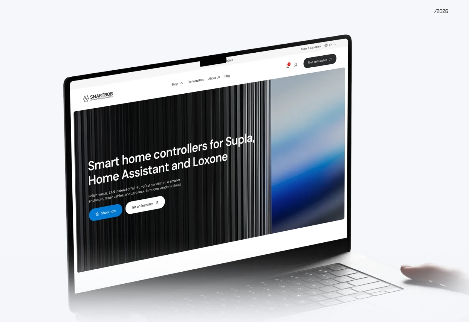
SMARTBOB. Designing an online store for a smart home manufacturer
A single DIN-rail module in place of a dozen, compatible with Supla, Home Assistant and Loxone. The UX and look of a store that has to sell a technical product to two very different audiences.
Client
- SMARTBOB
Services
- UX/UI design, Information architecture
The premise
UX and visual design of an online store for a Polish smart home brand that sells to homeowners and installers alike.
[01]
Overview
SMARTBOB is a Polish company making modern smart home controllers. A single unit on a DIN rail handles lighting, blinds, heating and the rest of an installation, and it works with well-known platforms such as Supla, Home Assistant and Loxone.
I was asked to design the UX and the visual side of a new online store. Besides selling technically advanced products, it had to put order into the range, help customers make up their minds and give the brand room to grow. Developers from my team then built it from those designs.
[02]
The challenge
SMARTBOB's products are bought by two groups that have little in common.
On one side are people building or renovating their own home, who are new to building automation. On the other are professional installers and smart home integrators, who expect thorough technical documentation, clear partnership terms and an efficient way to order.
The store therefore had to
- lead someone who is only discovering the product
- supply professionals with the specialist details they look for
- support both retail and partner sales
- earn the brand trust in a market for new technology
The brand also wanted to shake off the image of “yet another electronic module” and be seen as a maker of professional engineering.
[03]
Our approach
The work began with a look at how both groups buy and what each of them needs along the way.
It was clear early on that a product catalogue alone wouldn't be enough. The store had to answer people's questions before they reached out to the manufacturer, and walk them through the whole decision.
The design rests on three principles
- teaching the user
- making the technical advantages visible
- keeping the purchase as simple as it can be
[04]
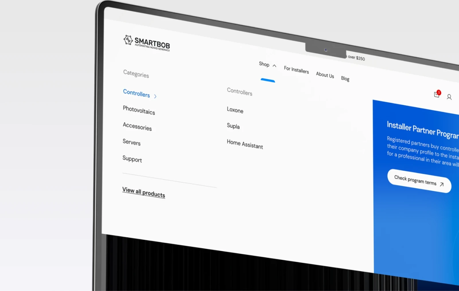
Store architecture
The store is laid out so that a visitor can go from first meeting the brand to a finished order without getting lost.
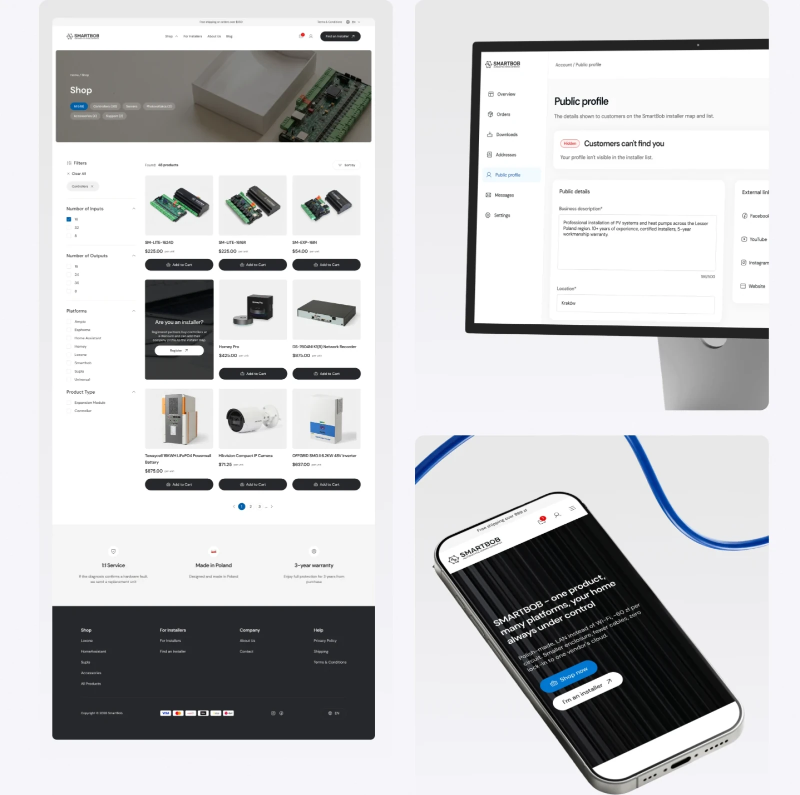
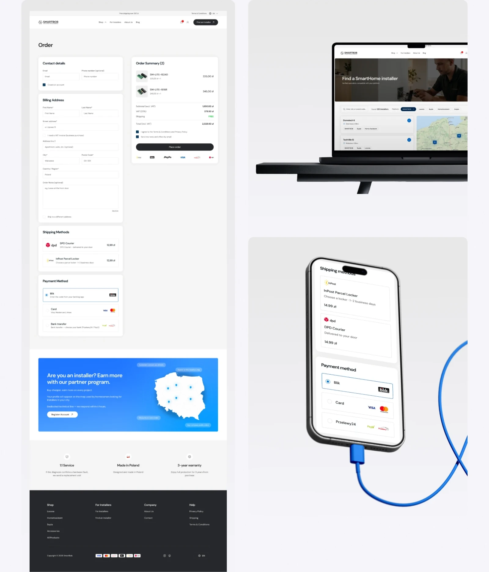
The designs covered, among other things
- a modern homepage that states the value proposition plainly
- a broad product listing with technical filters
- product pages that pair detailed specifications with practical notes on where each device belongs
- a short, predictable checkout
- separate accounts for customers and for installers
- a knowledge section planned around education and SEO
[05]
Putting the product's advantages forward
A big part of the work was showing what the devices can do technically in a way that also makes sense to people who aren't specialists.
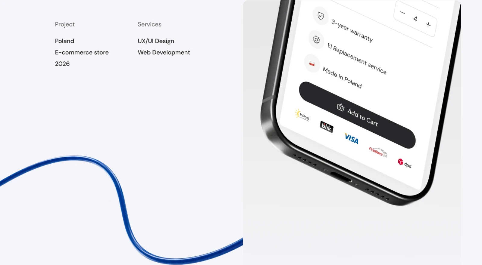
SMARTBOB's main strengths are brought to the front, including
- one device doing the job of many modules
- compatibility with Supla, Home Assistant and Loxone
- local operation, with no cloud required
- no subscription fees
- production in Poland
- a three-year warranty and service straight from the manufacturer
Beyond presenting the range, the store deals with the doubts people most often have before buying a smart home system.
[06]
One store for customers and installers
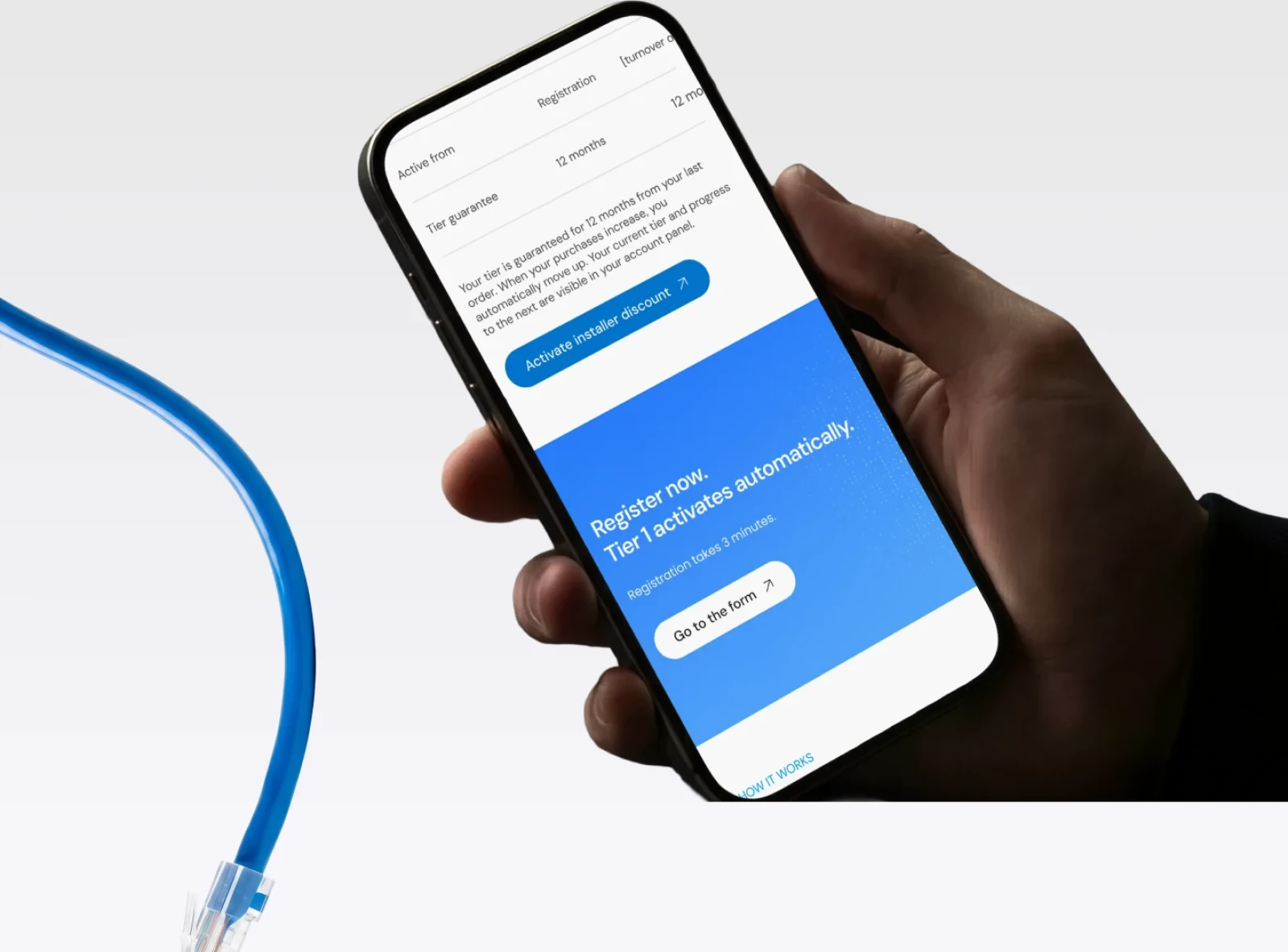
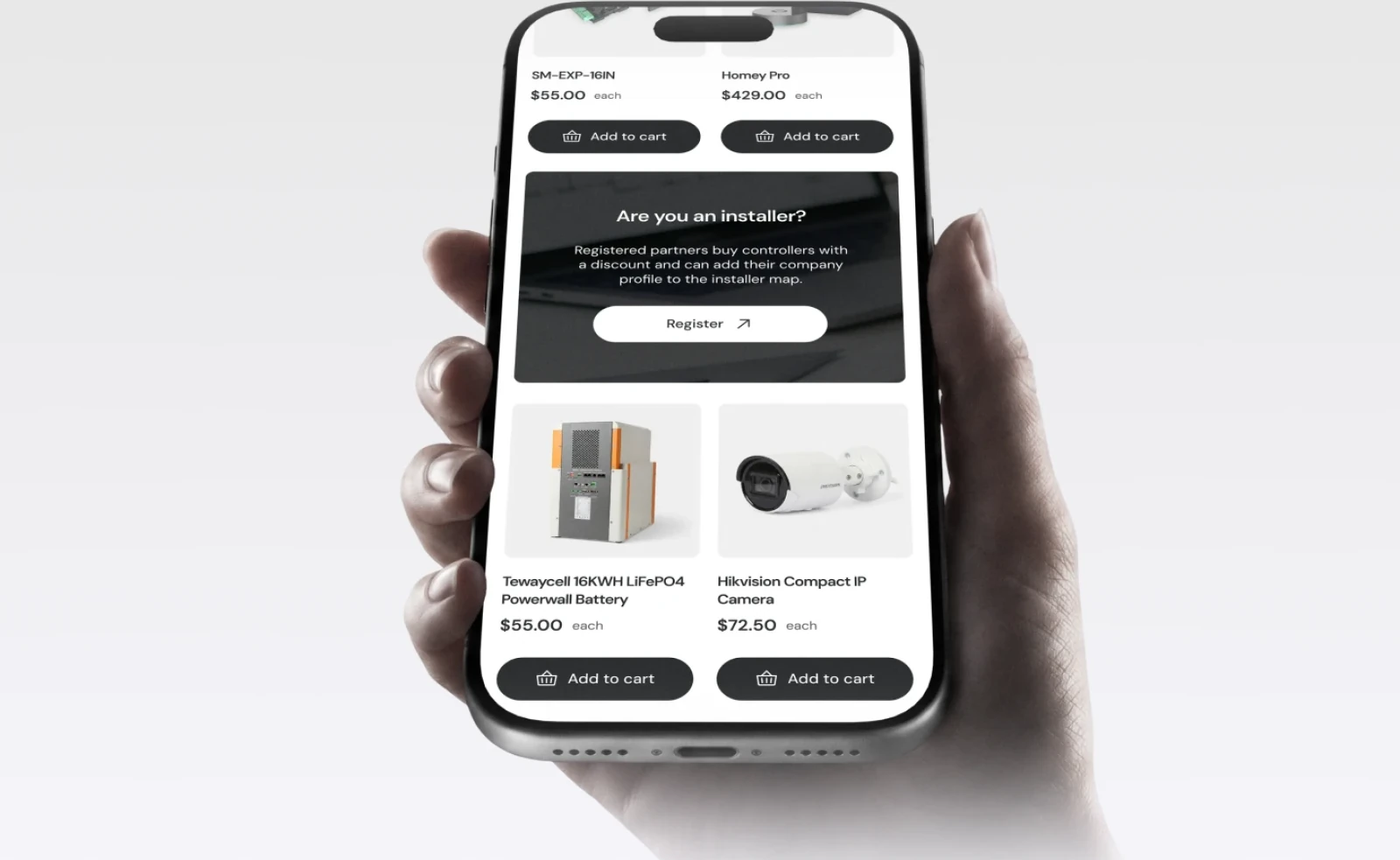
An important thread of the project was bringing retail sales and business partners together in one interface, so installers don't have to use a separate B2B system.
The installer panel I designed provides
- self-registration
- the correct discount tier, assigned automatically
- net and gross prices
- materials made for installers
- convenient ordering
[07]
An interactive map of installers
Among the largest pieces of the design was a map of certified SMARTBOB installers.
I designed the full path: an installer signs up through a form on the site and sends in their details, after which an administrator reviews the application.
When it is approved, and the installer agrees to be listed, they appear on an interactive map that anyone visiting the store can use.
With the map, customers can
- look for an installer in their area
- check where they are based
- go to the installer's profile
- write to them about a quote, an installation or a consultation
SMARTBOB's partners gain another way to reach customers.
[08]
A knowledge base that supports SEO
The project also includes a broad knowledge section.
It serves as a blog, a help centre and an SEO resource all in one.
Its layouts leave the manufacturer space for
- guides
- setup instructions
- expert articles
- videos
- answers to the questions people search for most
[09]
A calm look for a technical product
The visual side had to pull the brand away from “yet another electronic module” while still letting the engineering behind it show.
I designed the interface as a set of modules instead of one-off pages, so new sections and landing pages can be assembled from pieces that already match.
Among other things, the design covers
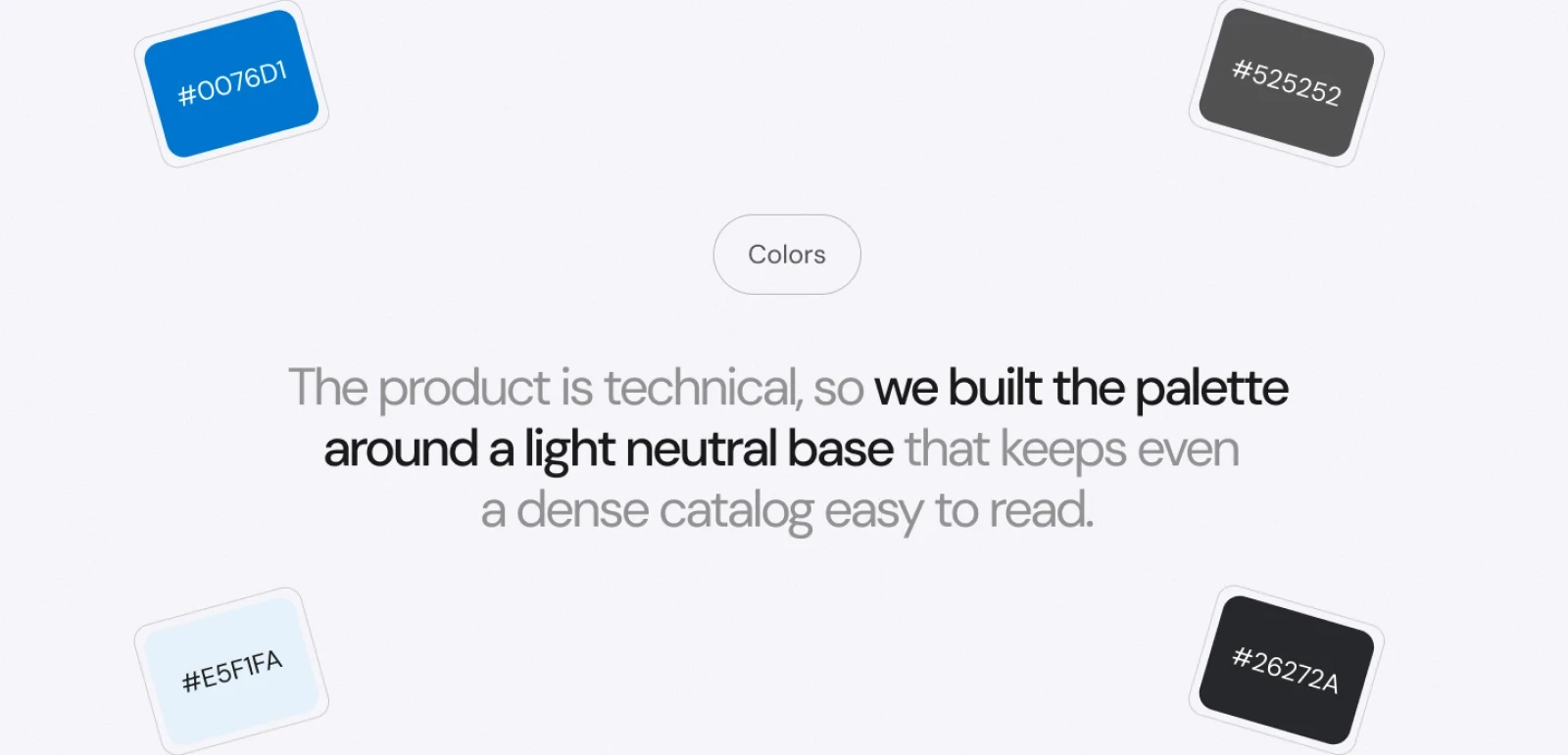
- a light neutral palette with a single blue, #0076D1, reserved for actions
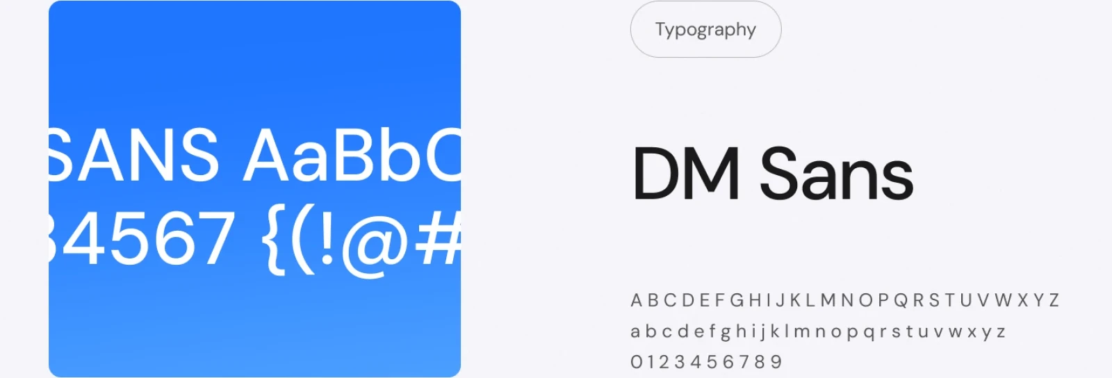
- DM Sans as the only typeface, which keeps a dense catalogue readable
- a library of reusable page modules
- desktop and mobile layouts for every key screen
[10]
The result
The result is a store that sells to customers and installers in one place.
It supports SMARTBOB through
- B2C and B2B sales in a single interface
- a home for a network of certified installers
- space for SEO and content marketing
- a modular design that can keep expanding
My part was the UX and the visual design; developers from my team turned it into a working store.
Next step