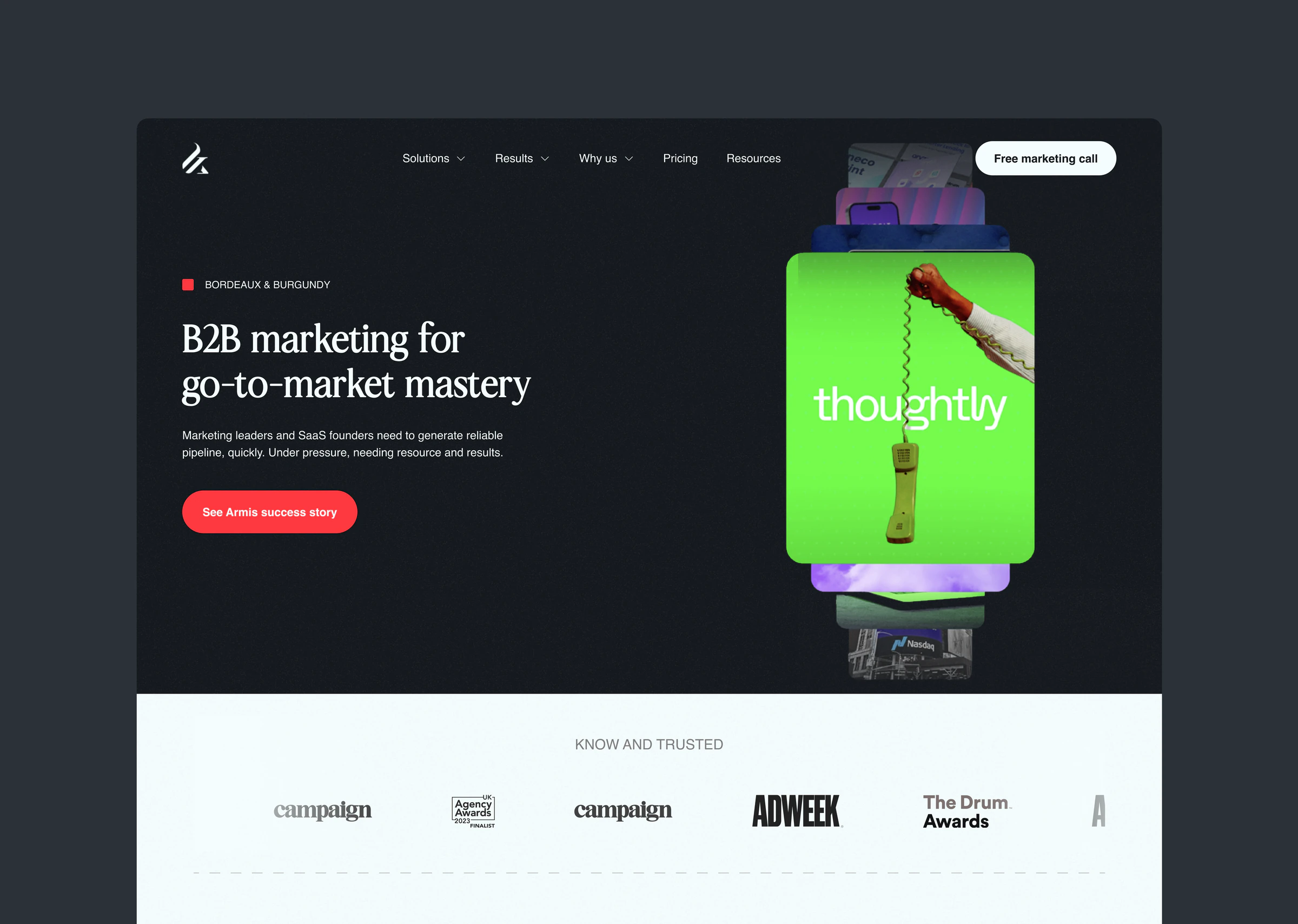
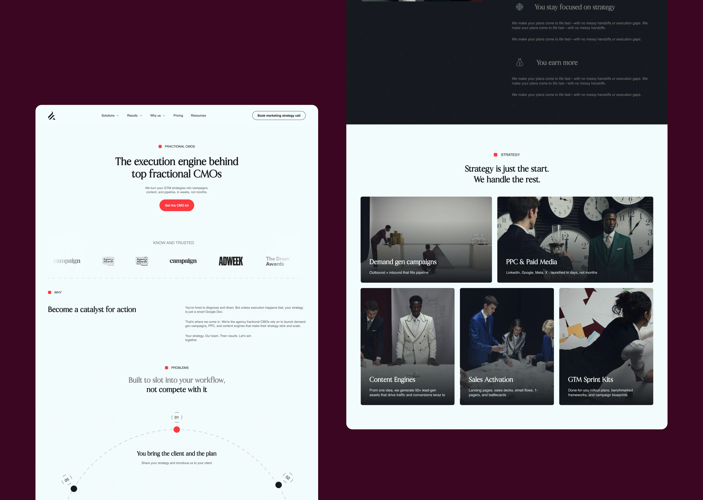
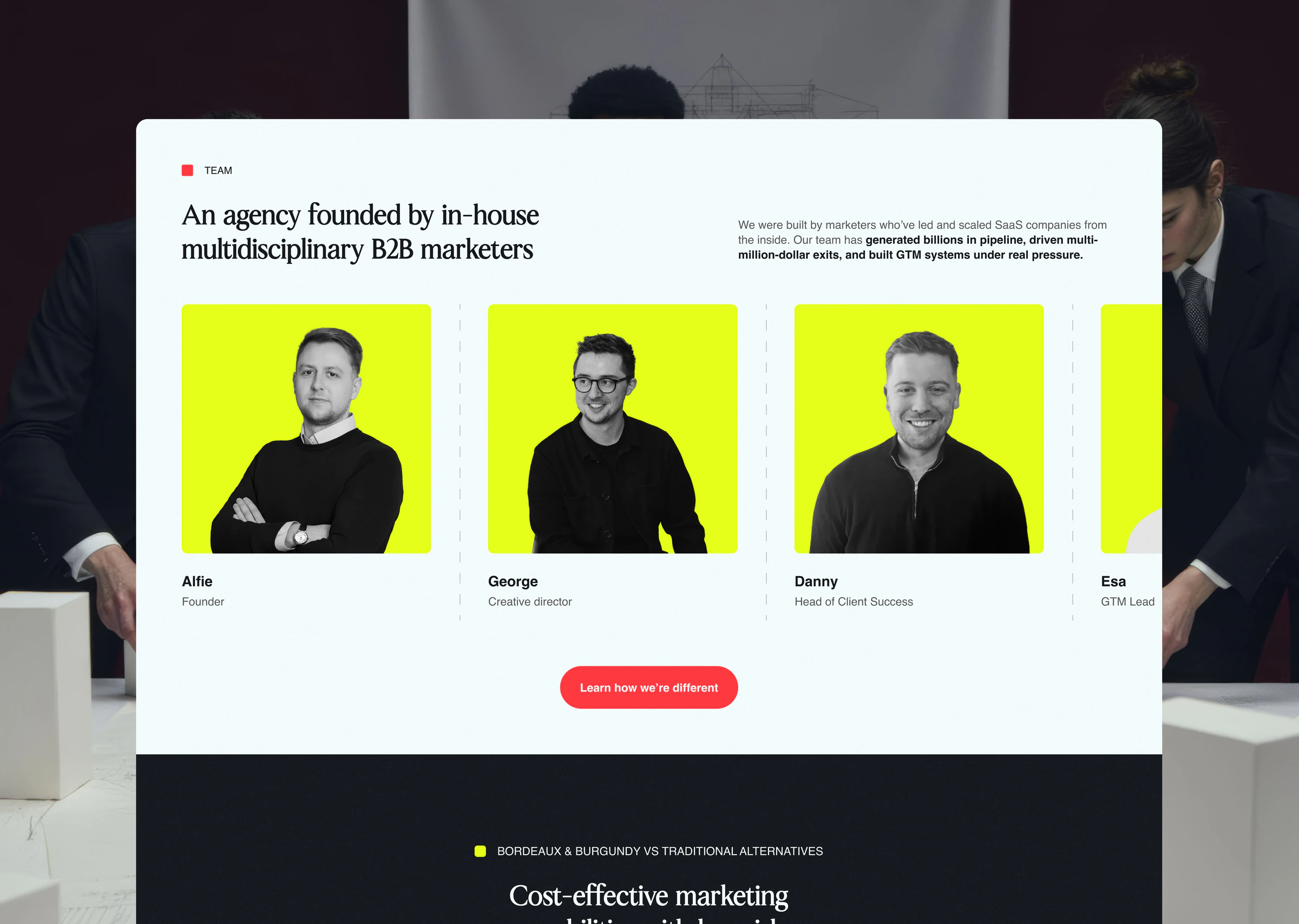
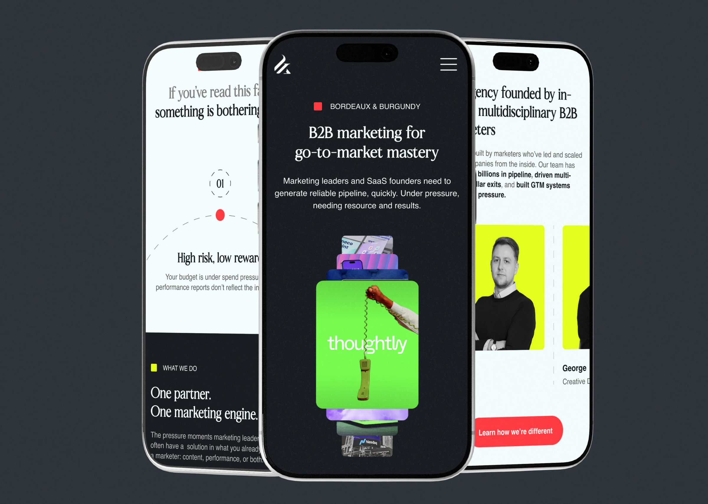
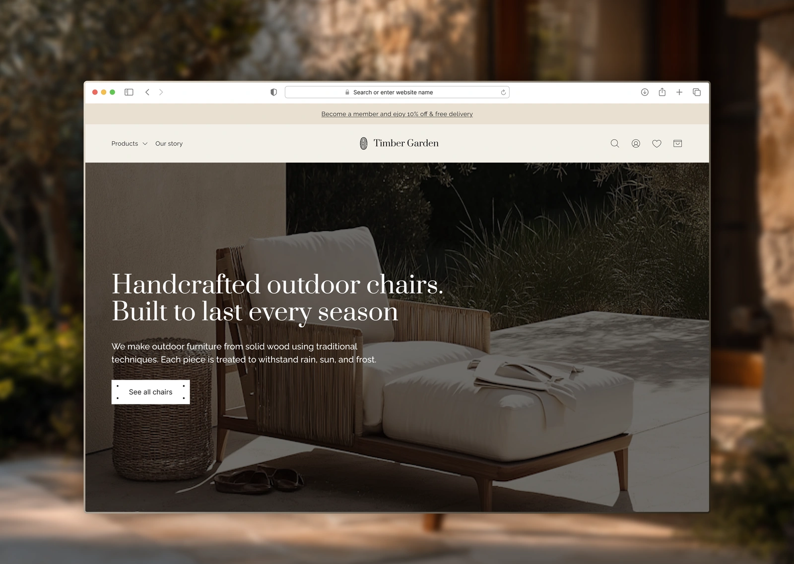
A website design for a marketing agency
The agency was changing its visual identity, and the website was stuck with the old one. I redesigned 18 pages, one at a time, while the brand was still taking shape.
Services
- Web design
- UX research
- Conversion optimisation
Bordeaux & Burgundy is a UK marketing agency for B2B SaaS companies in the US and UK, from Seed to Series D. In 2025 I spent 3–4 months designing their new website. A developer I work with built it.
The problem
The agency was changing its visual identity, and the website was stuck with the old one. The colours didn't match. Some sections didn't fit the new direction.
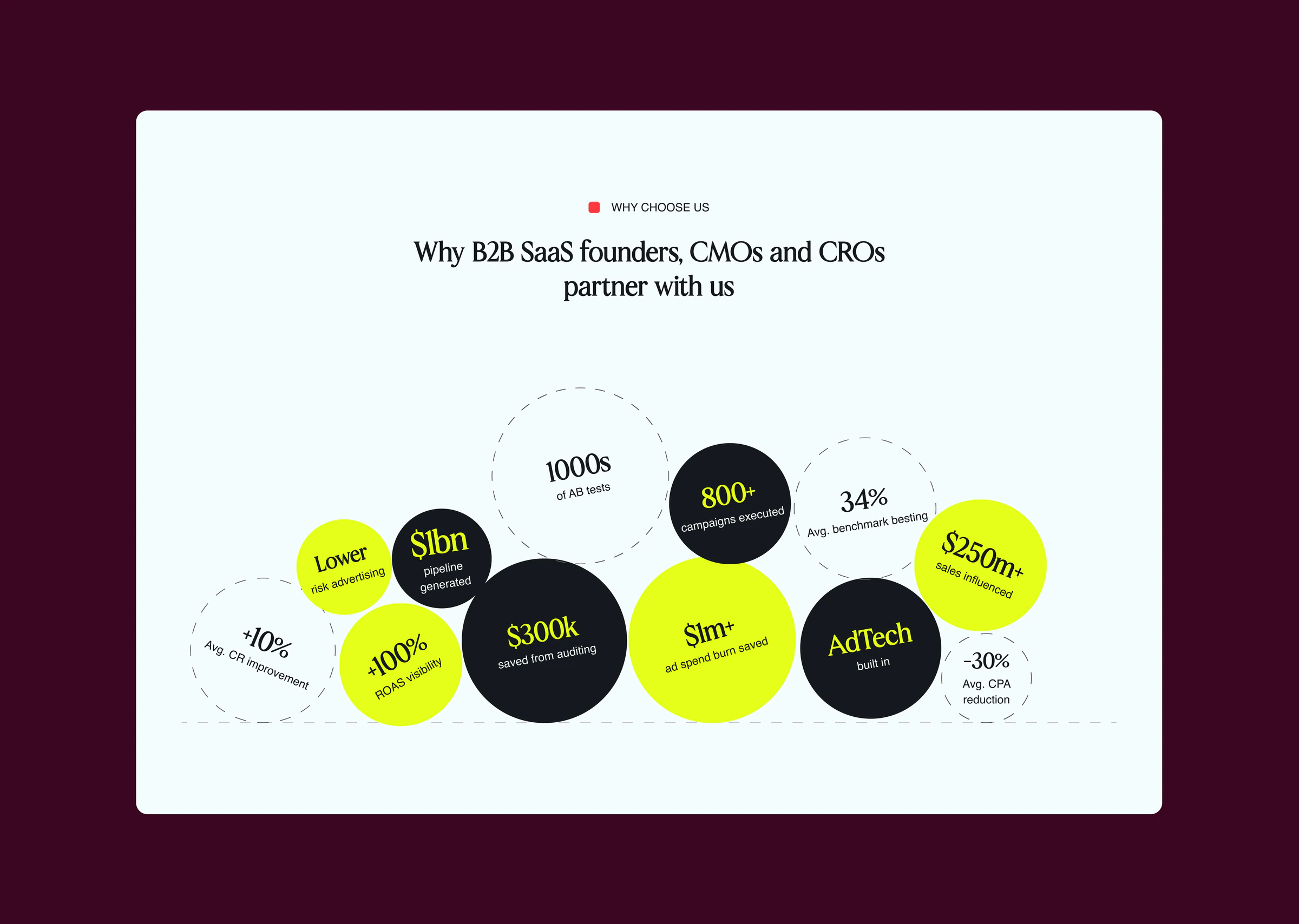
The team also needed landing pages for ad campaigns, a separate one for each client group. They'd never had pages like that.
The process
We worked on one page at a time. A design for the whole site could have gone out of date before the brand settled.
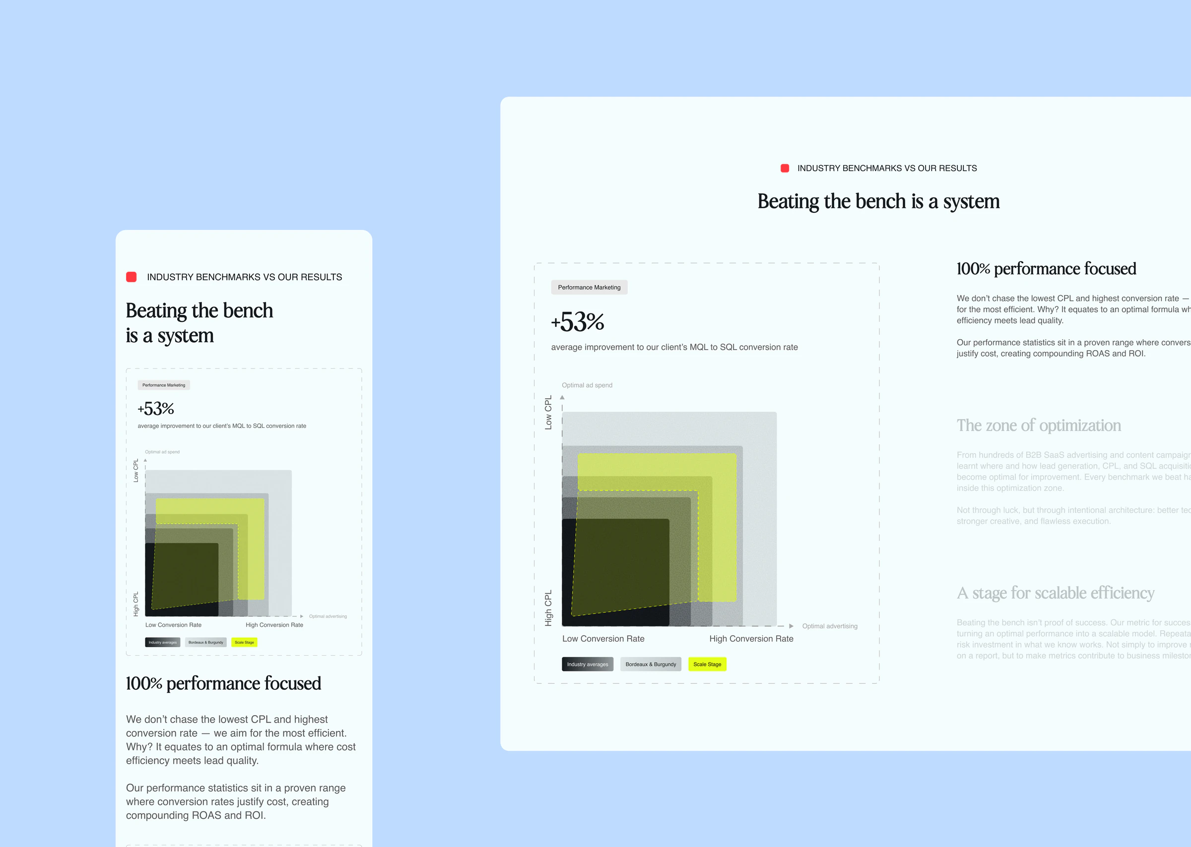
I started with the campaign landing pages, because the agency didn't have any. That's where we worked out the new visual language. Then I moved the existing pages over to it, until almost the whole site had changed.
Every page went through the same loop. The team sent me a task and I prepared 2–3 options. The creative team picked one and sent feedback, and I revised until they approved it. Then the developer built the page straight away, so the new landing pages didn't wait for the rest of the site.
The result
18 redesigned pages. They include new landing pages for campaigns and individual client groups, and most of the existing pages in the new identity.

“Igor played a big part in shaping both our website and our brand. During the refresh we changed direction more than once, and every time he helped us work out what to do, keep what was working, and come up with fresh ideas right when we needed them.”
 George SaundersCreative Director at Bordeaux & Burgundy
Has your business outgrown its website?