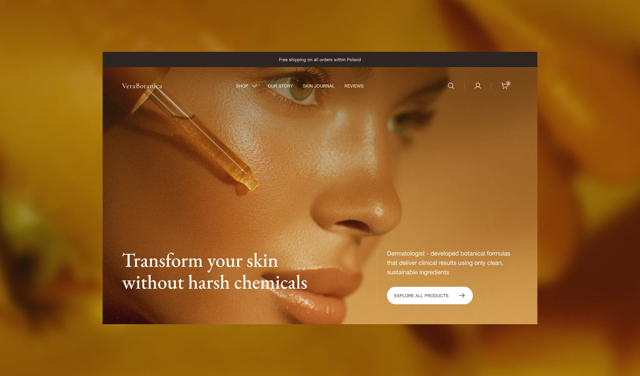
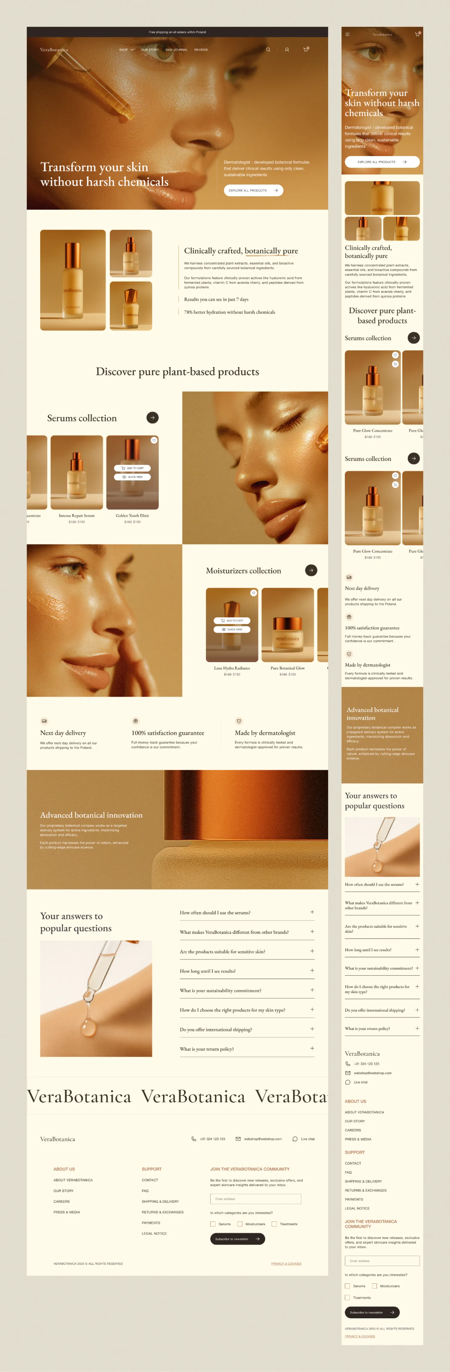
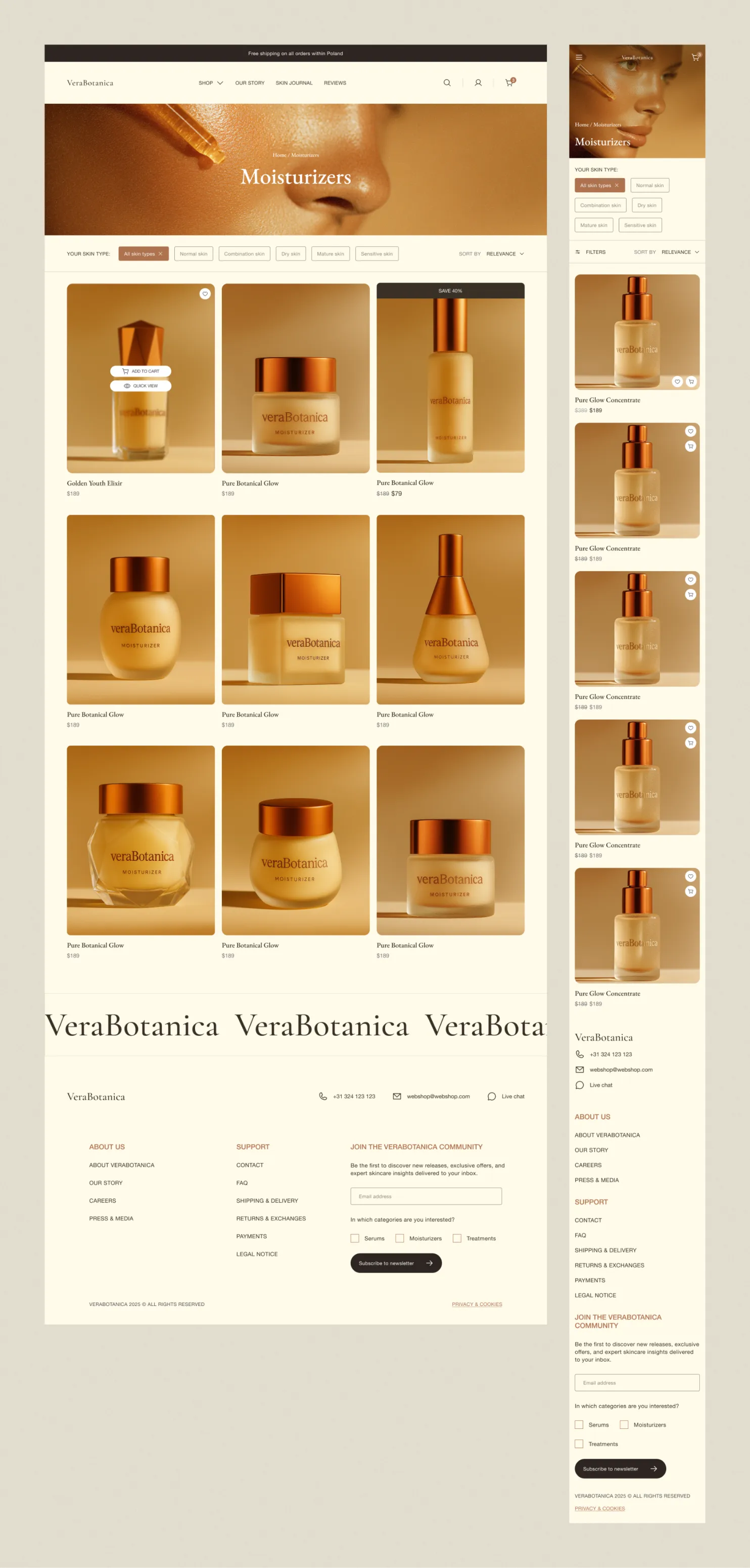
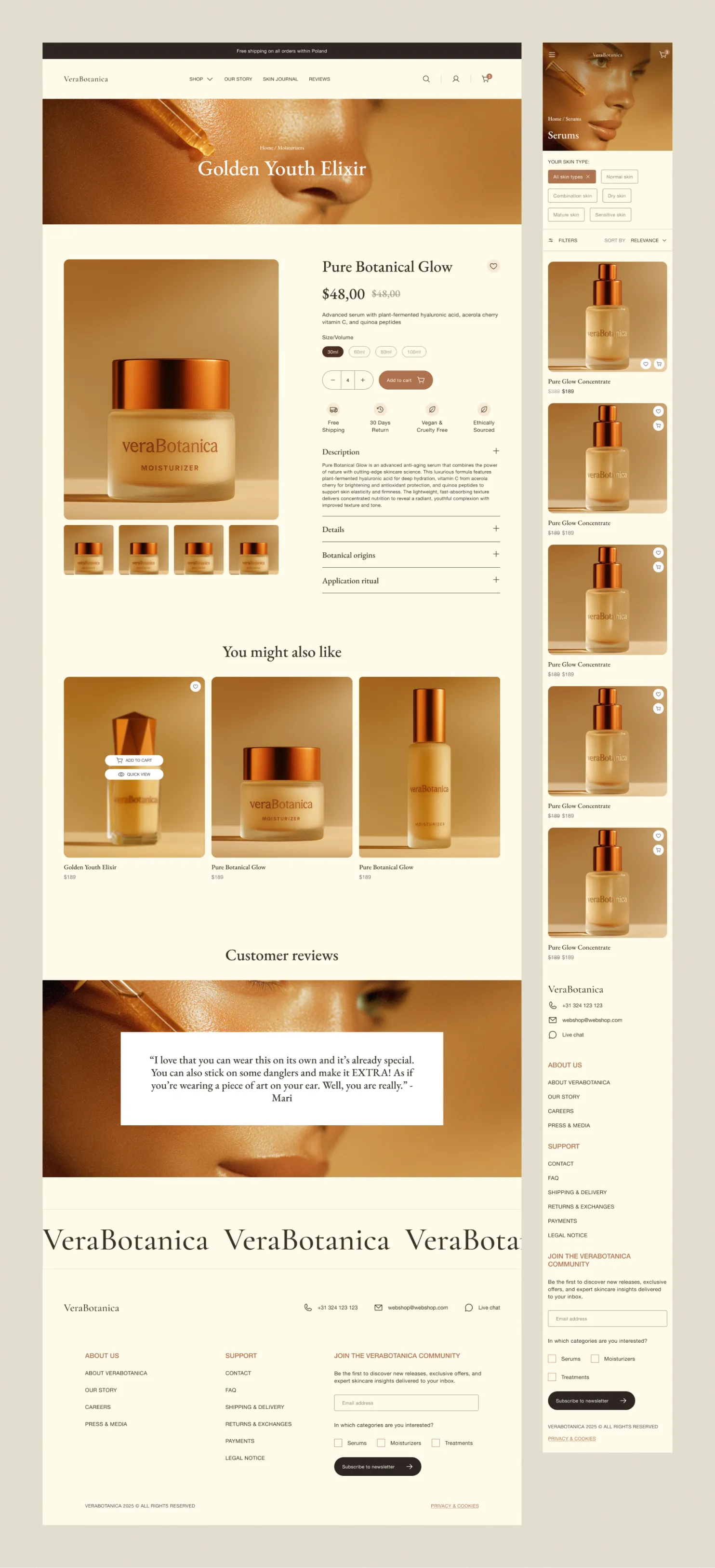
An online store design for a skincare brand
A woman spending €180 on a serum isn't shopping by price. She's shopping by her problem.
Services
- UX/UI design
- Visual identity
- AI imagery
VeraBotanica sells natural skincare between €50 and €180, and the whole project turns on one question: what makes someone comfortable spending that on a brand she doesn't know? There was no photography and no budget for it, so every product image was generated in Midjourney, which freed the time for what actually drives a premium purchase.
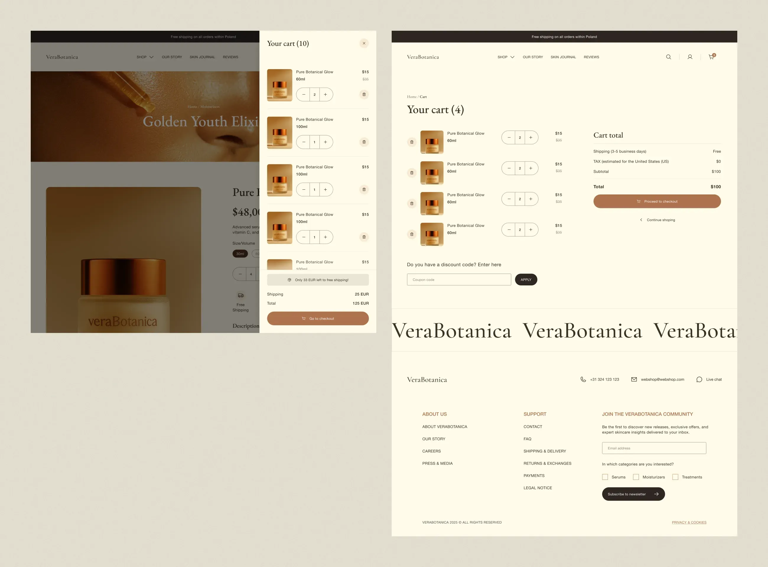
Every page in the path has one job. The homepage builds credibility, the category page helps her find her product, the product page justifies the price, and the cart removes reasons to hesitate. Skin-type filters sit above the product grid, so narrowing the results is one tap. Four trust signals sit directly under the add-to-cart button, where the doubt appears. And the cart is two interfaces: a drawer that keeps the momentum, a full page for someone who has already decided.
Has your business outgrown its website?