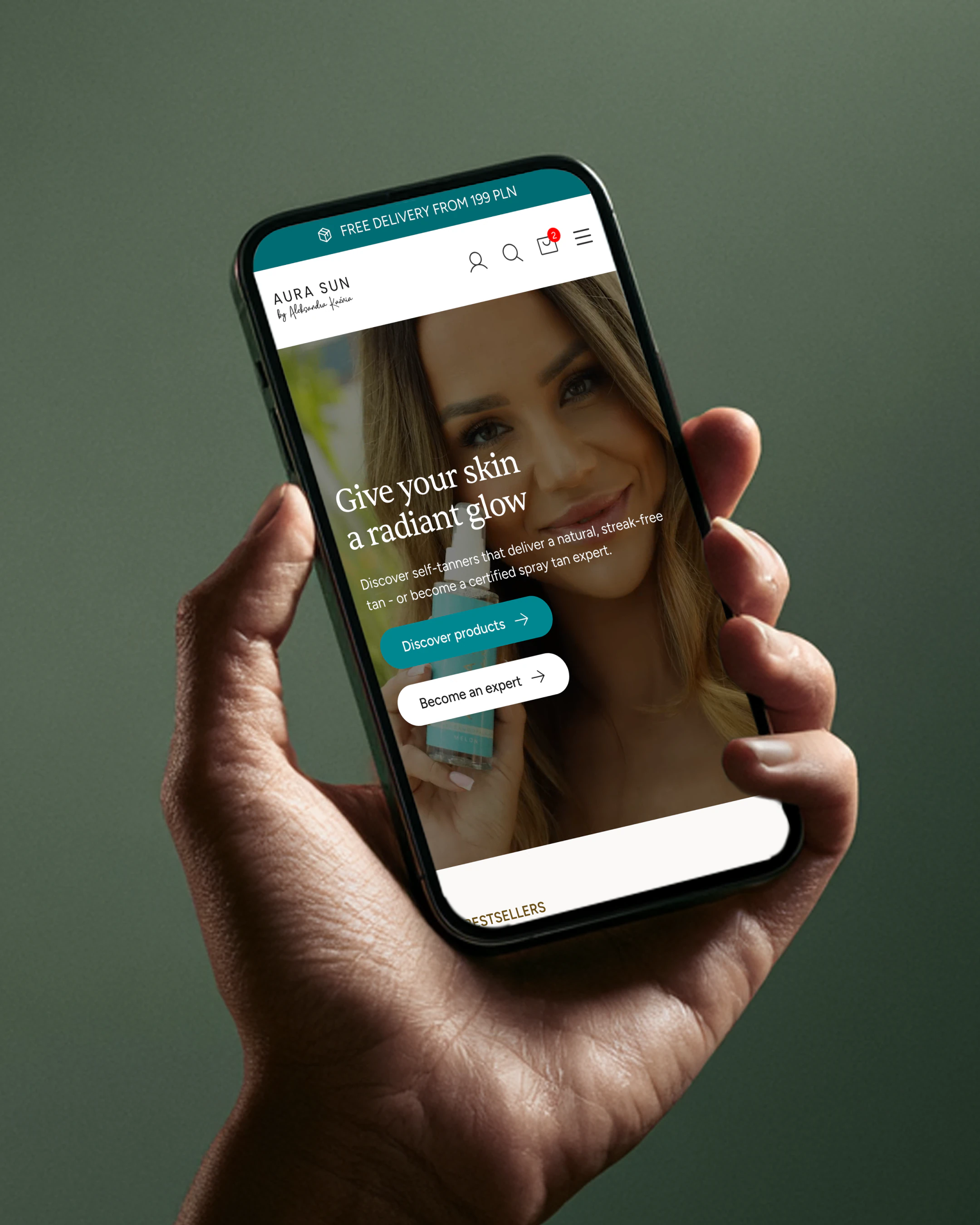
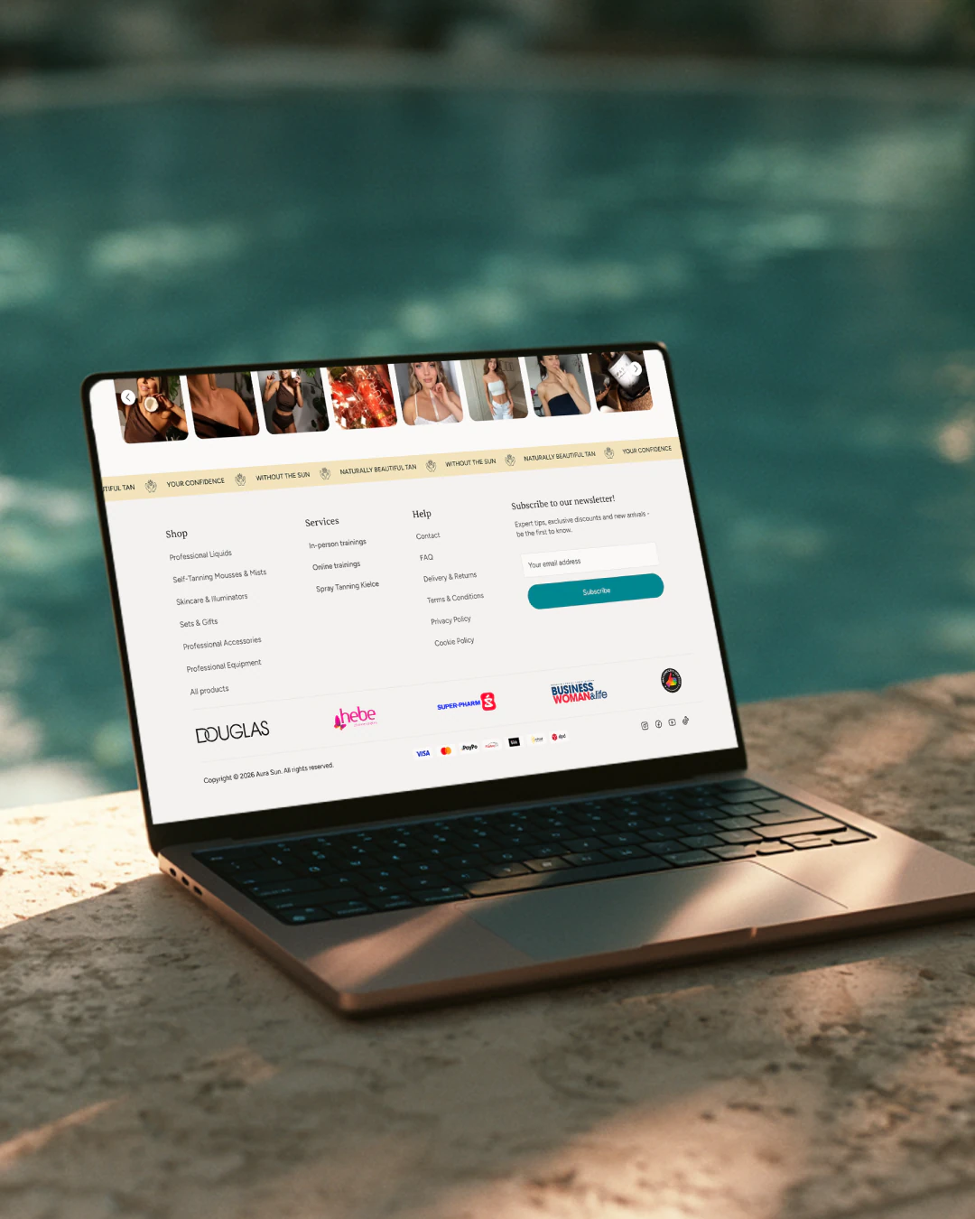
5 weeks. 86% higher conversion. A new version of the AuraSun store.
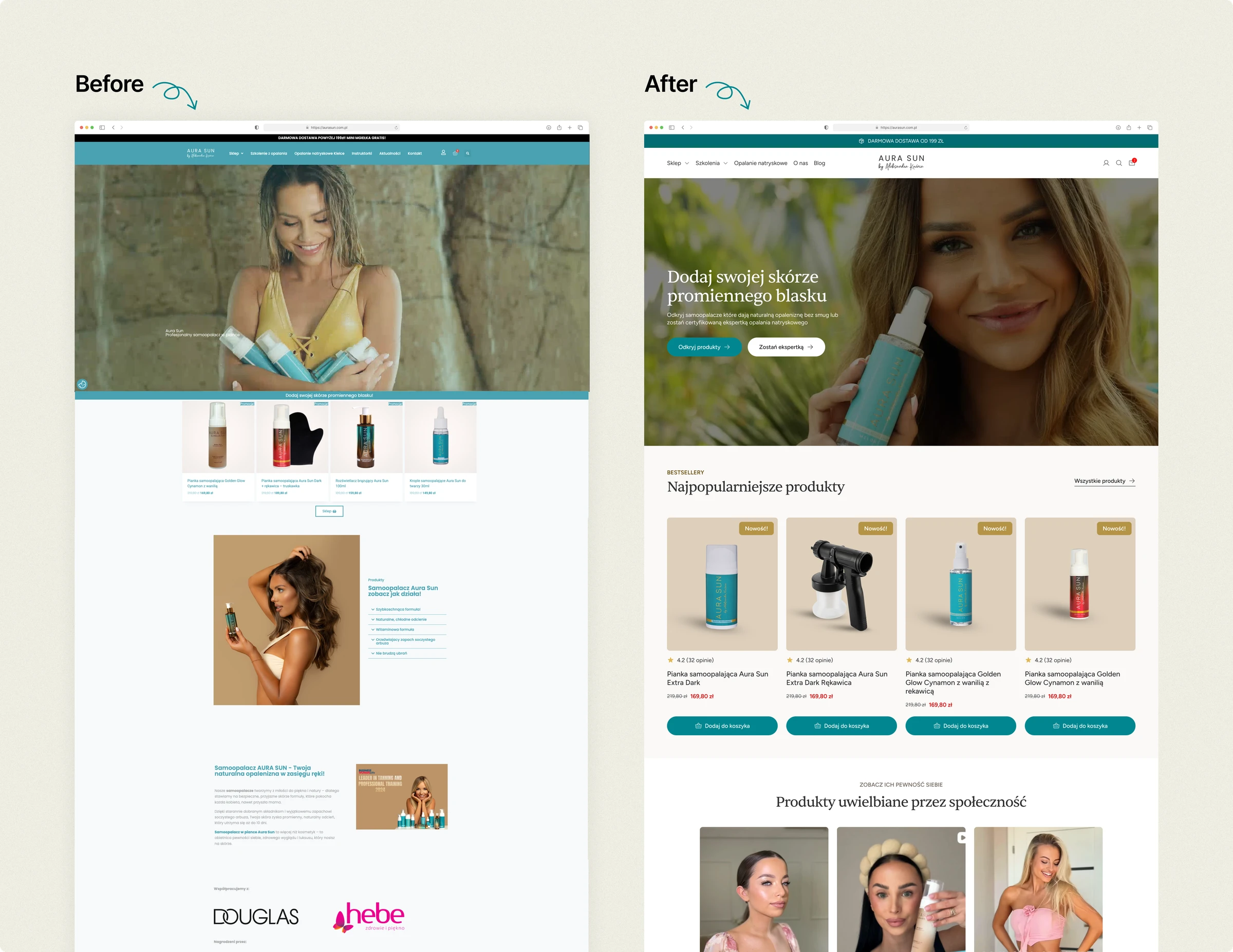
AuraSun came with a simple brief: make the store look like the brand the company has become. And make it sell better, if you can.
Services
- UX/UI design
- Conversion optimisation
- Analytics & tracking
AuraSun is a Polish self-tanning brand, stocked by Douglas, Hebe and Super-Pharm. The store had stayed a few years behind the brand: over five seconds to load on a phone, a layout that fell apart on mobile, and a homepage selling three businesses at once (products, training and a local salon) to one customer who came for a self-tanner. 94% of purchases came from mobile.
Five weeks, design and CRO on my side, the build handled by the client's own developer. I started with the data: GA4 with e-commerce events, and a matrix of reviews (the brand's own, Google's and the competition's), to know what customers fear and what they praise.
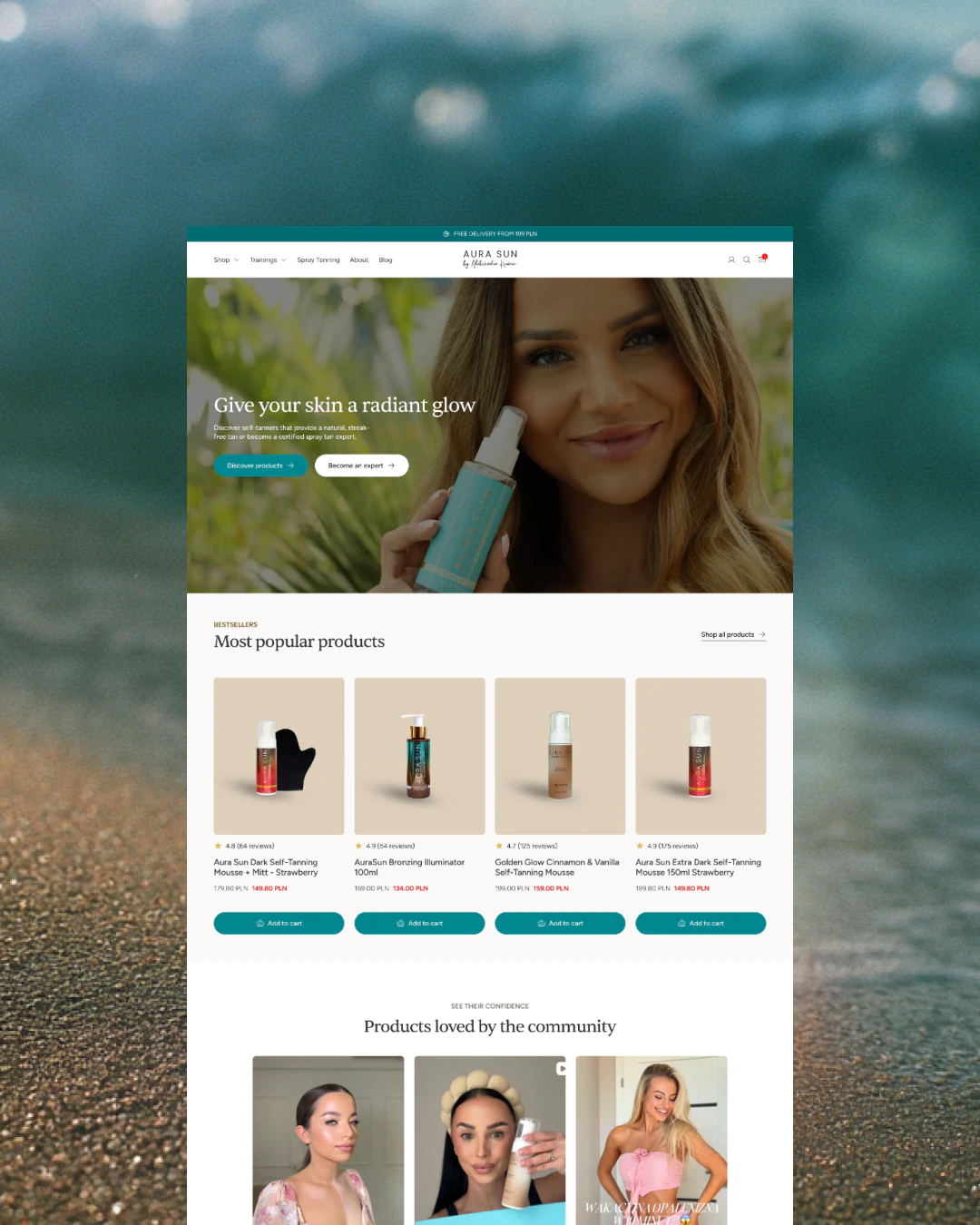
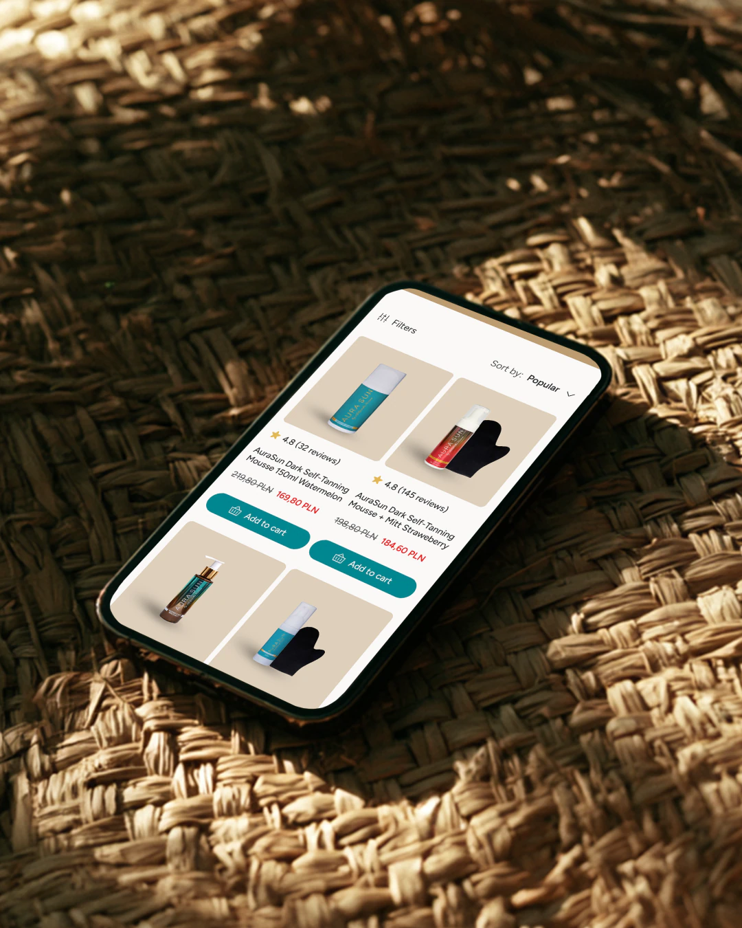
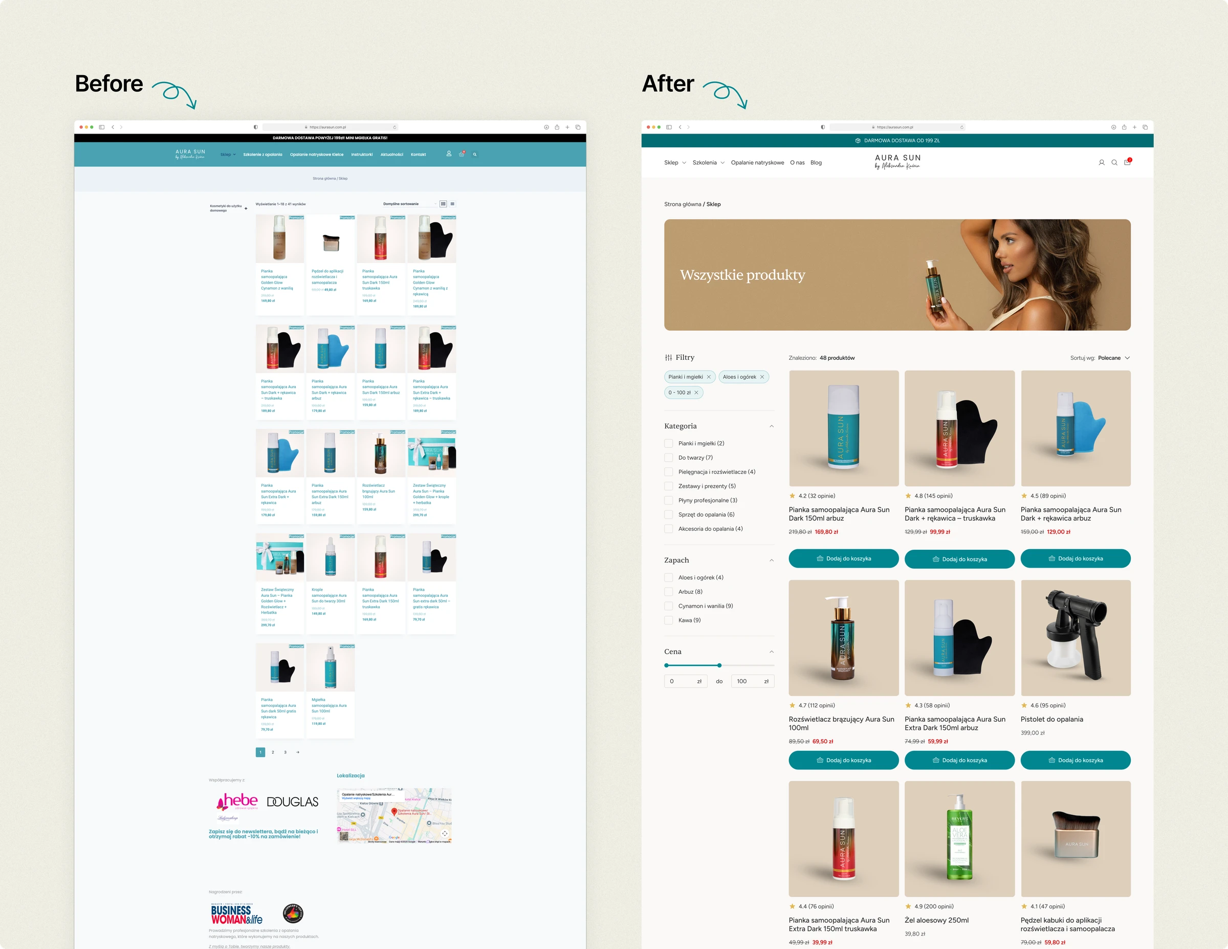
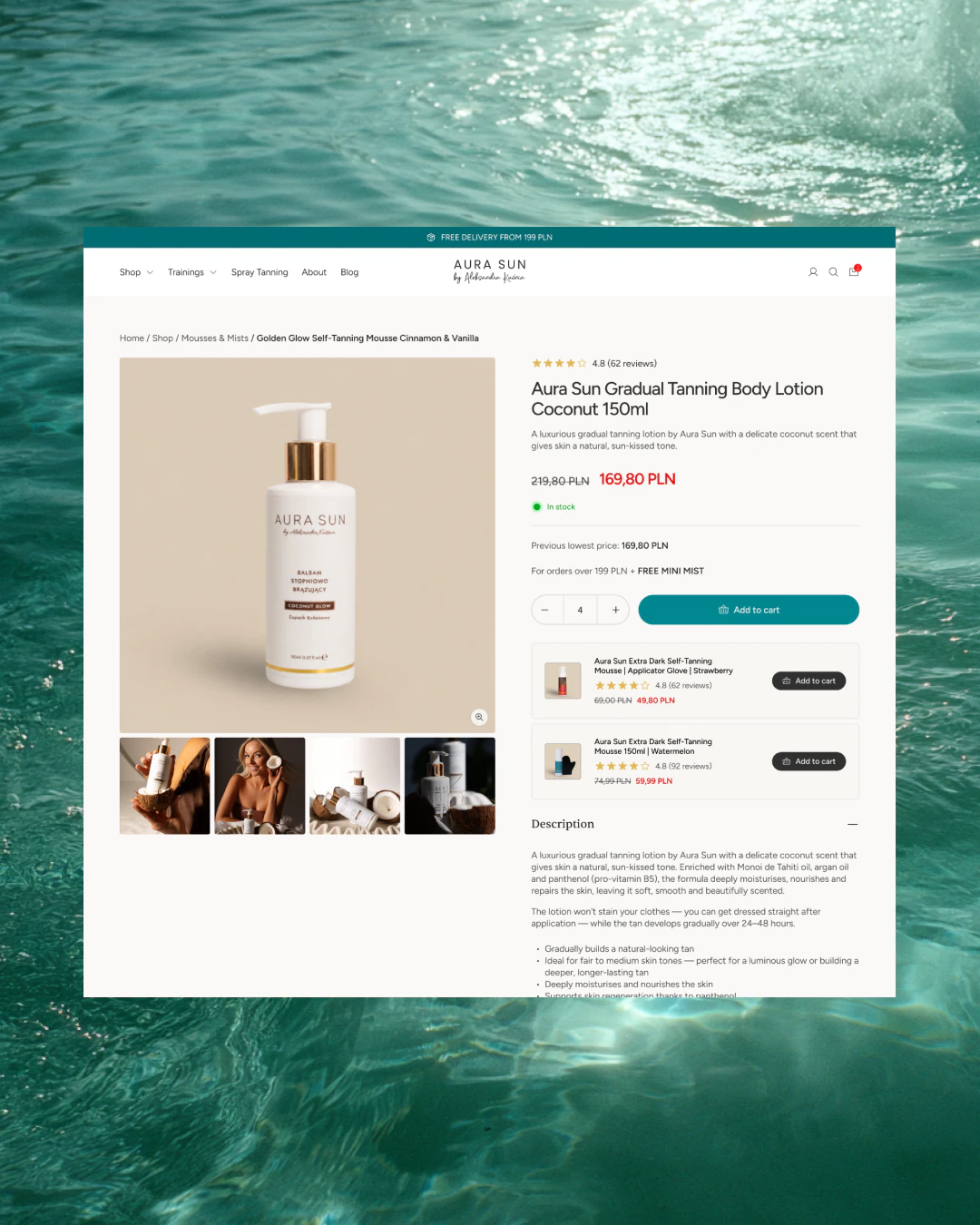
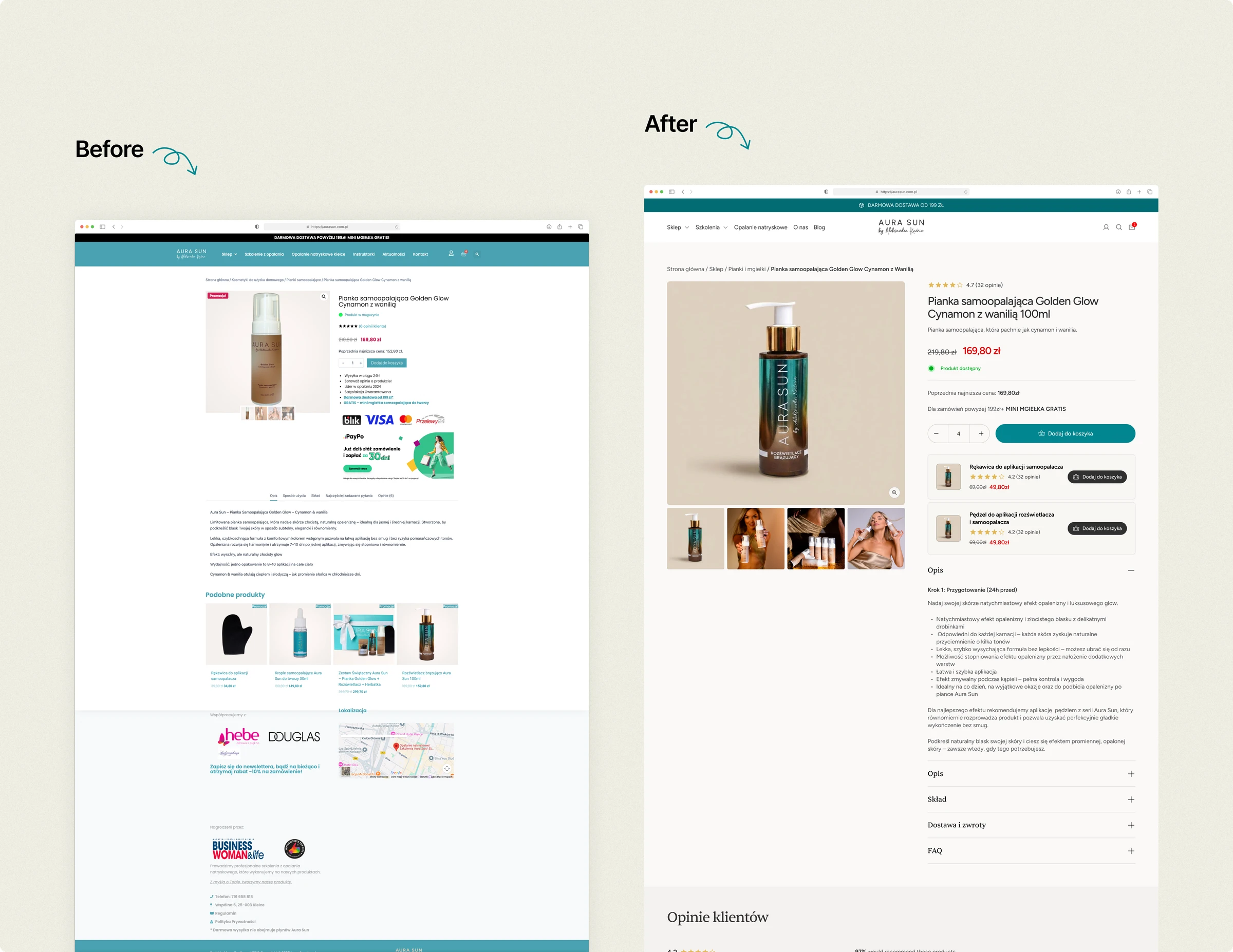
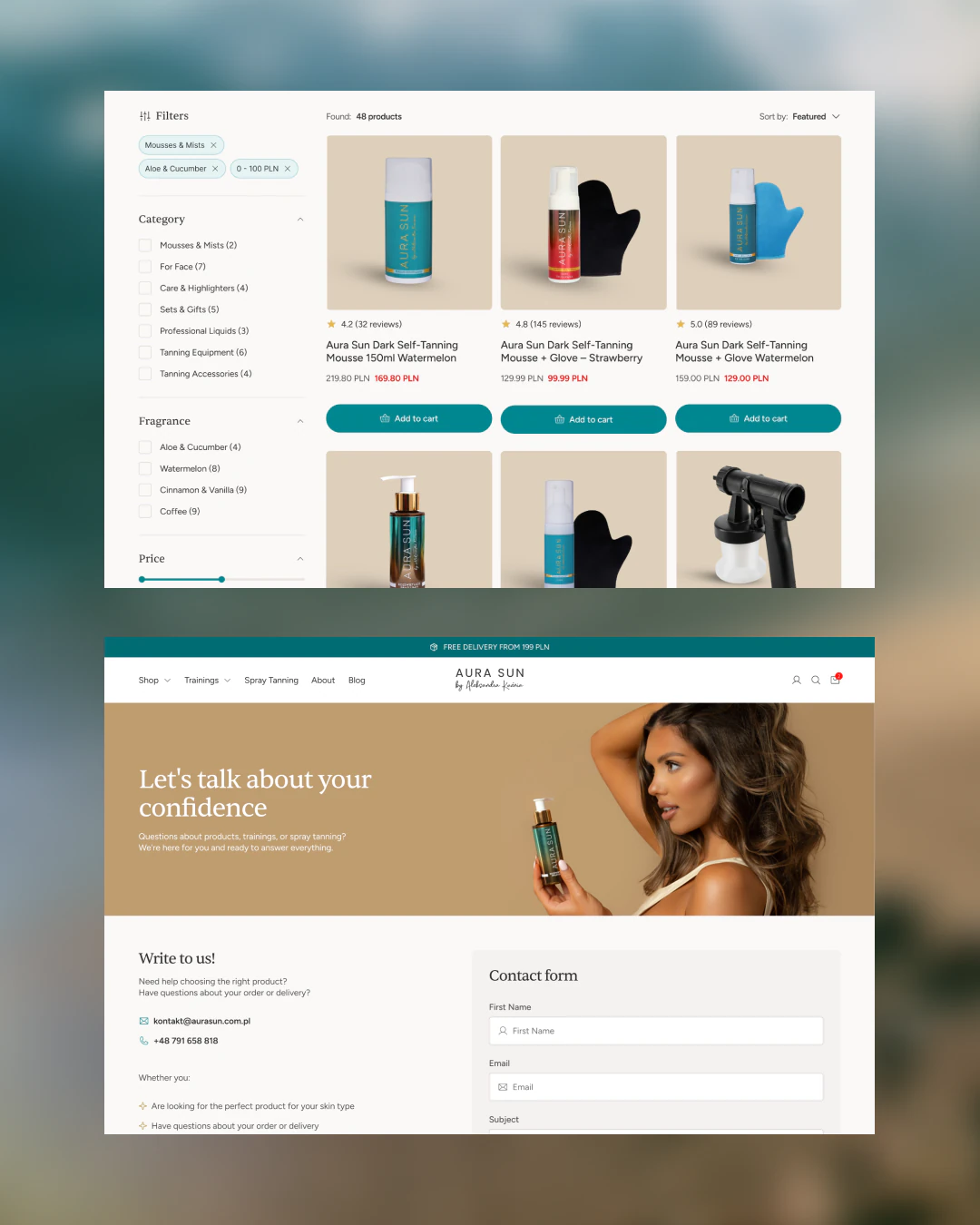
The homepage lost around 60% of its length and kept two choices in the hero. Listing tiles now carry the rating, the review count and the scent, because almost half of add-to-carts skipped the product page entirely. The product page leads with scent and answers the three worries that hold a purchase back. The cart gained a free-shipping threshold and delivery and payment marks.
60 days after launch, conversion went from 2.47% to 4.59%, up 86%. On mobile, from 2.30% to 4.47%, up 94%. Measured in GA4.

“60 days after launch my store's conversion rate rose by 86%, and checkout completion more than doubled, from 36% to nearly 75%. I came to Igor because I wanted a store that sells, not just one that looks good. He started with the data, found exactly where I was losing customers, and fixed it. Honest at every stage, no miracle promises, just measurable results.”
 Aleksandra KuźniaFounder of AuraSun
Has your business outgrown its website?