Gravrok. Visual design for a race-grade MTB store
The average MTB store is built for browsing. Gravrok is for riders who already know what they want and need the data to confirm it.
Client
- Gravrok
Services
- Web design
The premise
Visual design of a store for race-grade MTB bikes, where data and a configurator matter more than lifestyle shots.
[01]
Overview
Gravrok is an MTB brand made for XC and enduro racers, from amateurs entering local series to semi-pros.
My job was to design the visual layer of the store. The brand and the store weren't meant to sell “adventure” or “the joy of riding”, but an edge on the trail.
[02]
The challenge
Gravrok aims at the racer, not the tourist. A customer like that arrives knowing the geometry, weight and groupset they're after, and doesn't buy on impulse.
So the store had to
- earn technical credibility with racers and mechanics
- simplify the complicated decision of buying a race bike
- show data, compatibility and specialisation instead of slogans
[03]
Visual direction
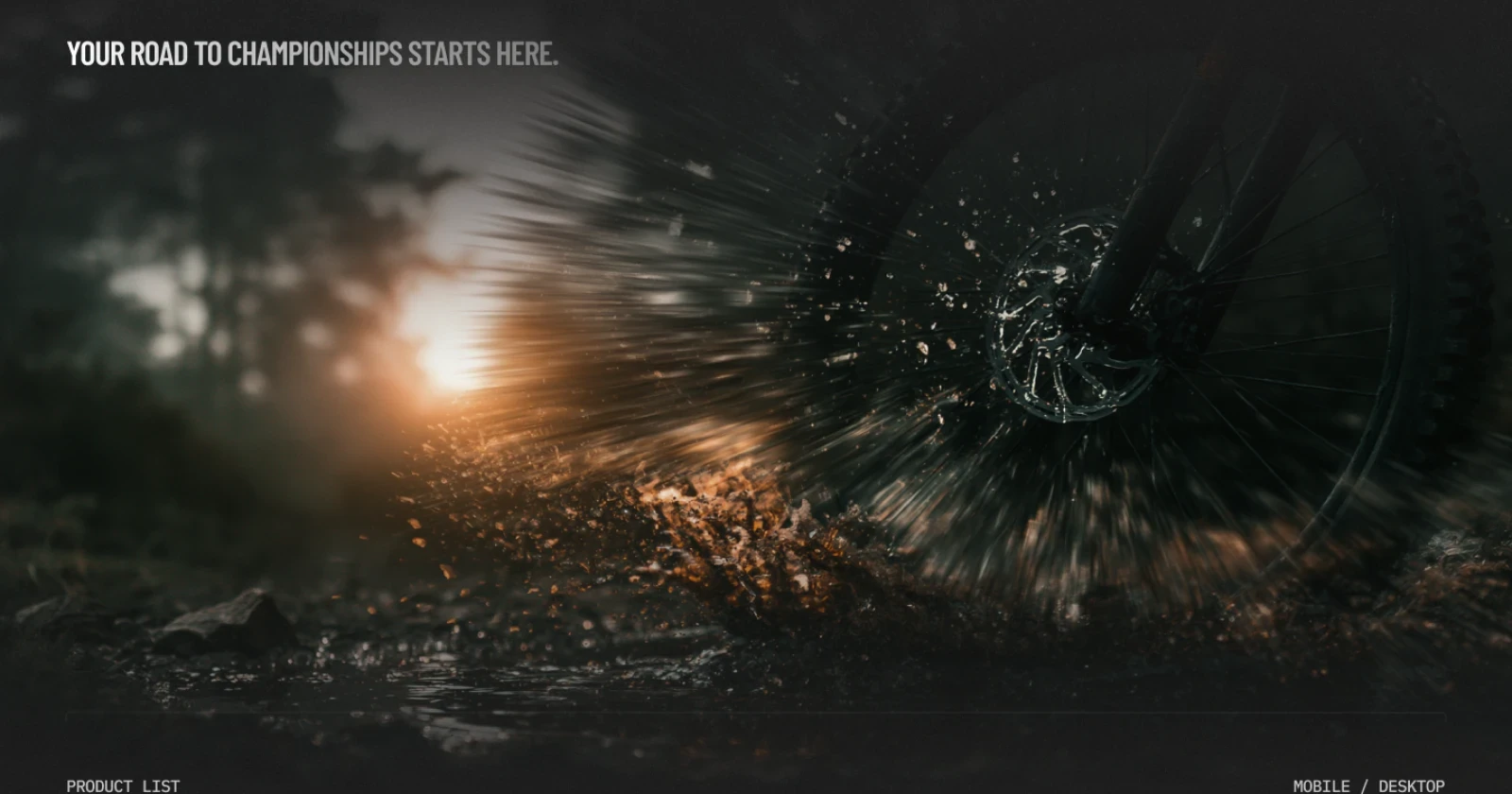
The main idea was to step away from the bike industry's usual conventions, lifestyle shots, smiling families and gradient backgrounds, towards technical precision.
I designed the visual layer so that it would
- be associated with results, equipment and service rather than leisure
- look like a racer's partner, not a touring catalogue
- build trust through clarity and hard facts
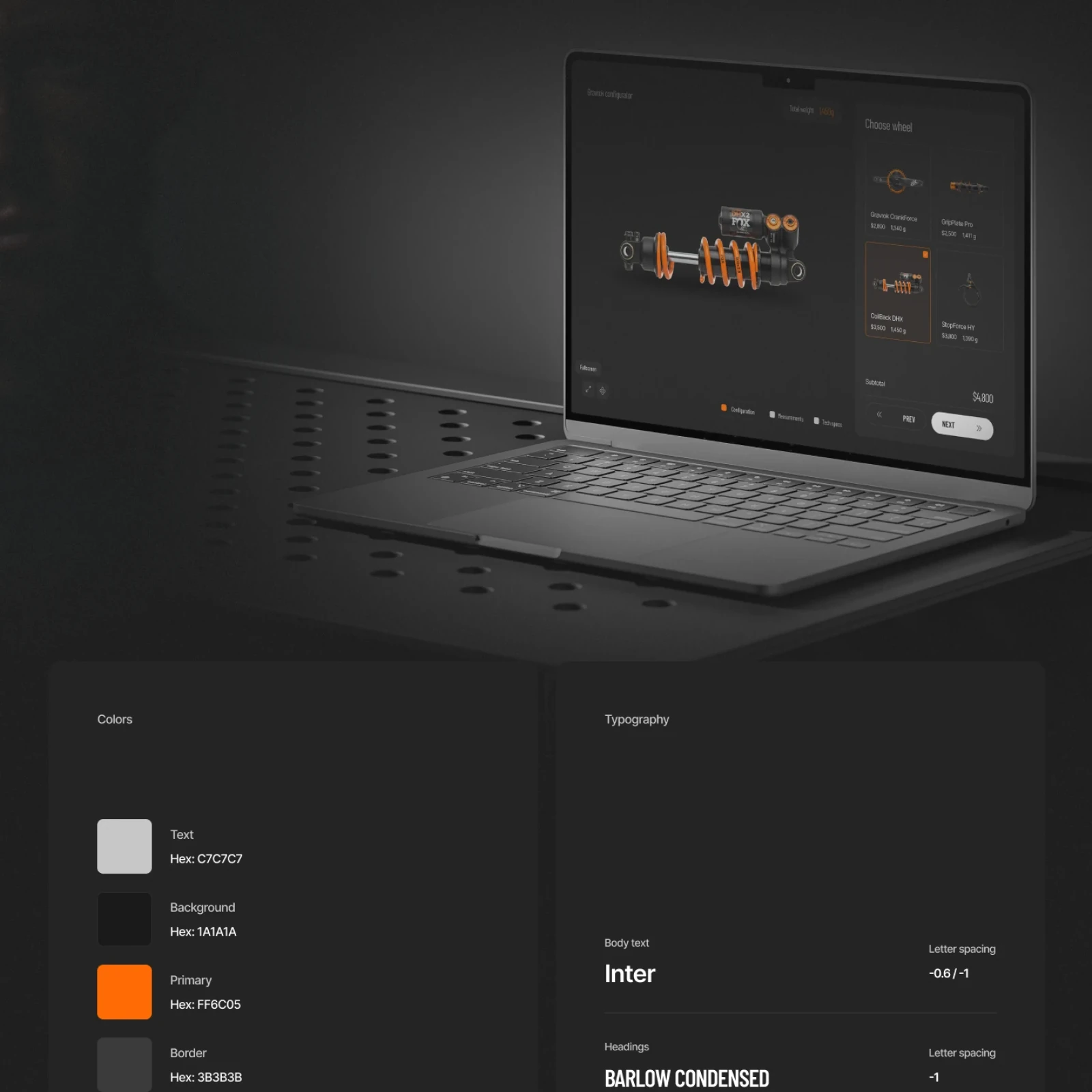
A stark palette of near-black backgrounds, chalk white and a single hard orange, #FF6C05, geometric shapes taken from technical drawings and headlines in Barlow Condensed over Inter make the brand look tough, technical and specialised.
[04]
Store structure
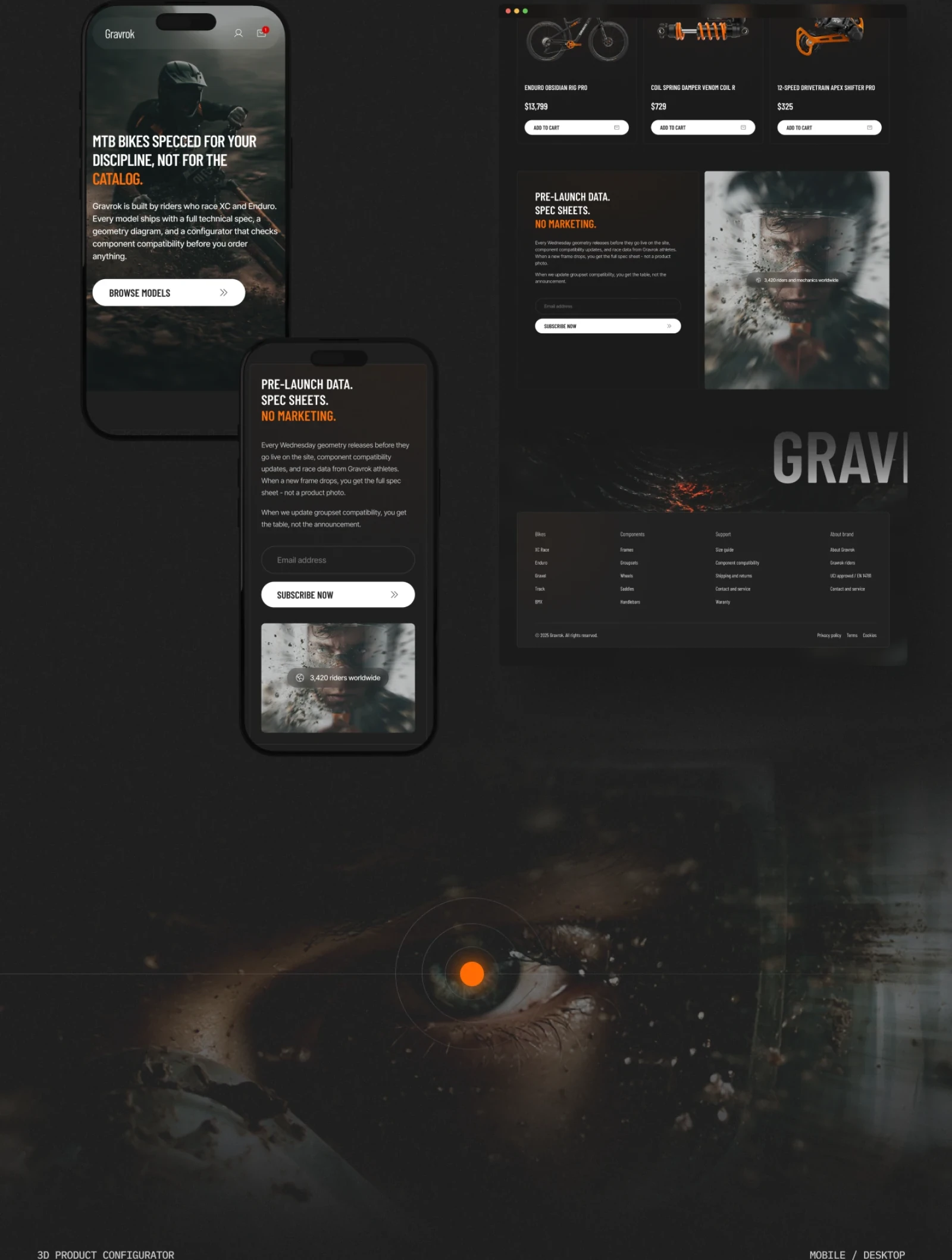
The store is built for a racer who needs to understand within seconds that they're in the right place, and know where to go next.
The key views are
- a homepage with a clear value proposition: “MTB bikes specced for your discipline, not for the catalog”
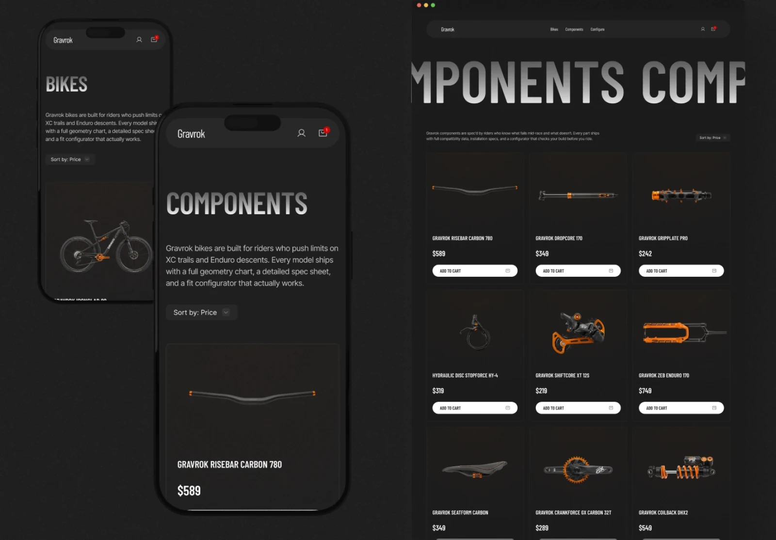
- bike and component listings with filters for technical parameters
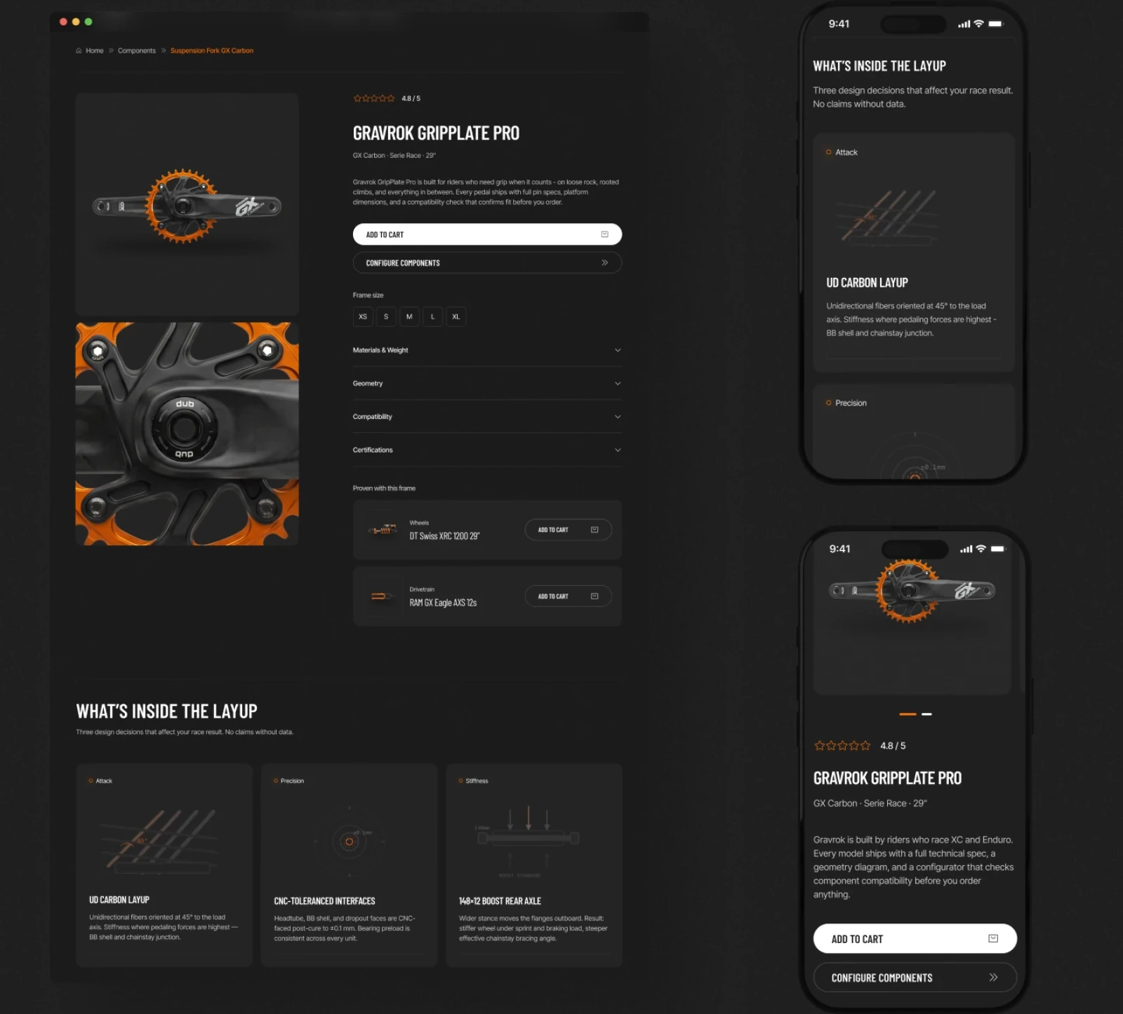
- a product page with the full spec, compatible parts and size selection
- a short cart and checkout, free of distractions
[05]
The configurator
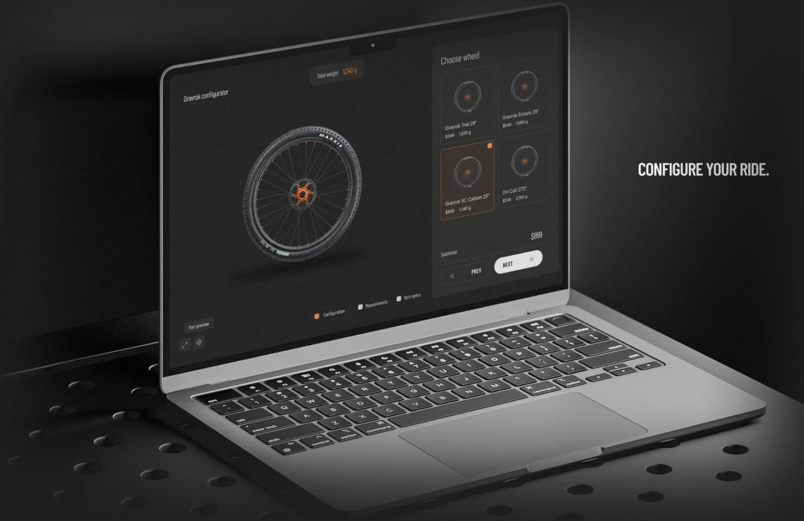
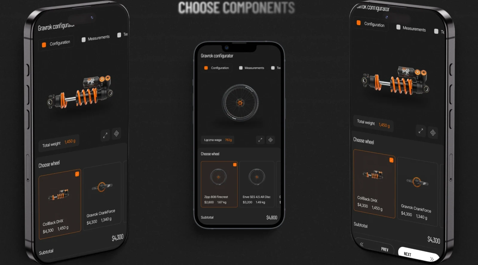
At the heart of the store is the configurator, which walks a rider through the frame, wheels, suspension and the rest of the components step by step.
It checks compatibility as you go, hides parts that don't fit the chosen frame, and keeps a running total of weight and price, on a laptop as well as on a phone. For a purchase this expensive, that genuinely lowers the risk of a mistake.
[06]
The result
The result is a technical, race-focused store that looks and speaks the way racers do.
The store
- supports a buying decision based on data
- builds trust through hard facts and transparency
- answers the real needs of MTB racers
My part was the visual layer: the direction, palette, typography, graphic motifs and the design of the key screens on desktop and mobile.
Next step