Muro Padel Club. Visual design for a padel club website
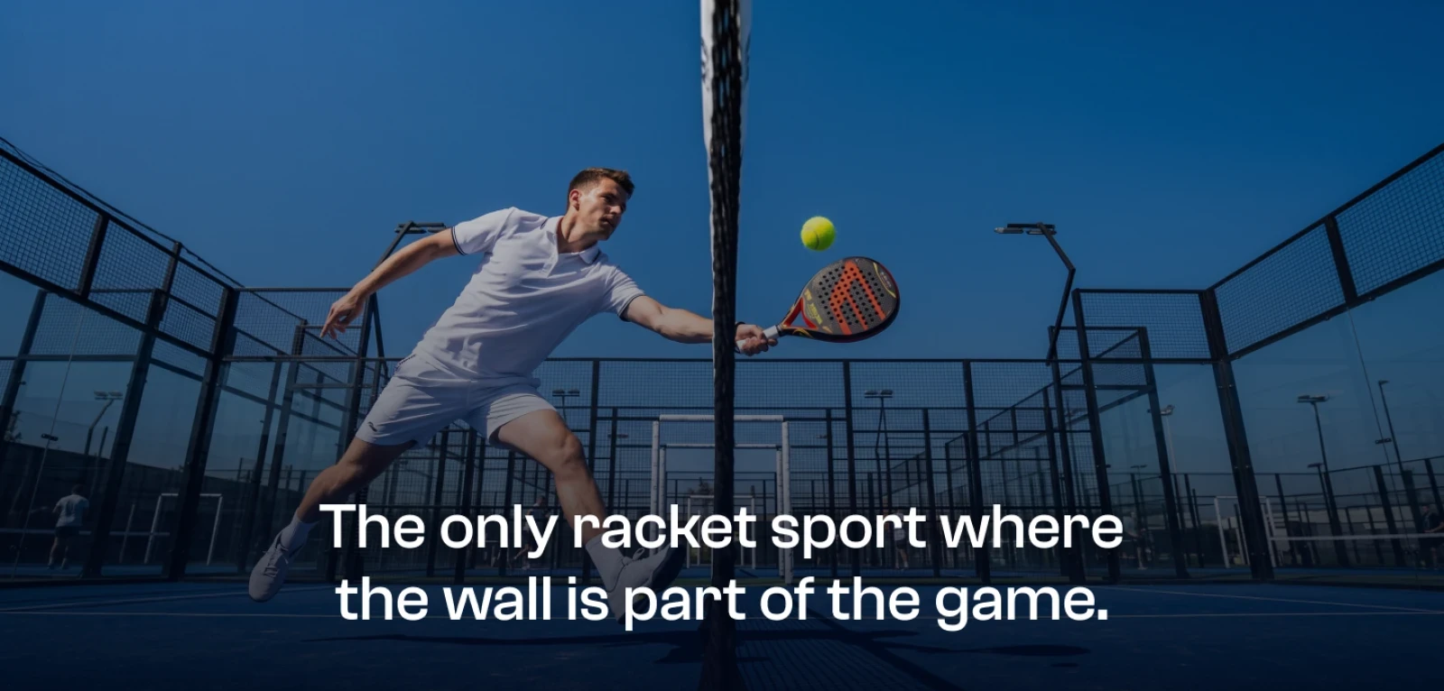
Padel is the only racket sport where the wall is part of the game. The site shows that to people who have never played, without losing the regulars who just want to book a court.
Client
- Muro Padel Club
Services
- Web design
The premise
Visual design of a website for a padel club in Valencia that wants beginners and competitive players alike.
[01]
Overview
Muro Padel Club is a padel club in Valencia, built for every kind of player: from people who have never held a racket to those competing in official tournaments.
My job was to design the visual layer of the website. The brand and the site weren't meant to sell “a lifestyle” or “the joy of the game”, but the one thing no other racket sport has: a wall that is part of play.
[02]
The challenge
Padel looks much the same almost everywhere: lifestyle shots, smiling couples and gradient backgrounds. It's easy to disappear in that.
The site also had to speak to two people at once: someone who has never played, and someone who already knows they want a court for tonight.
[03]
Visual direction
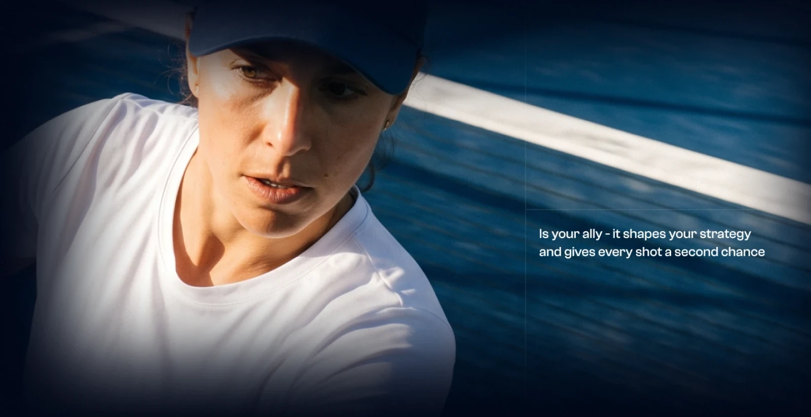
The starting point was a blue palette. Not as a matter of taste, but because top-level padel is mostly played on blue courts. It is quite literally the colour the game happens on.
I designed the visual layer so that
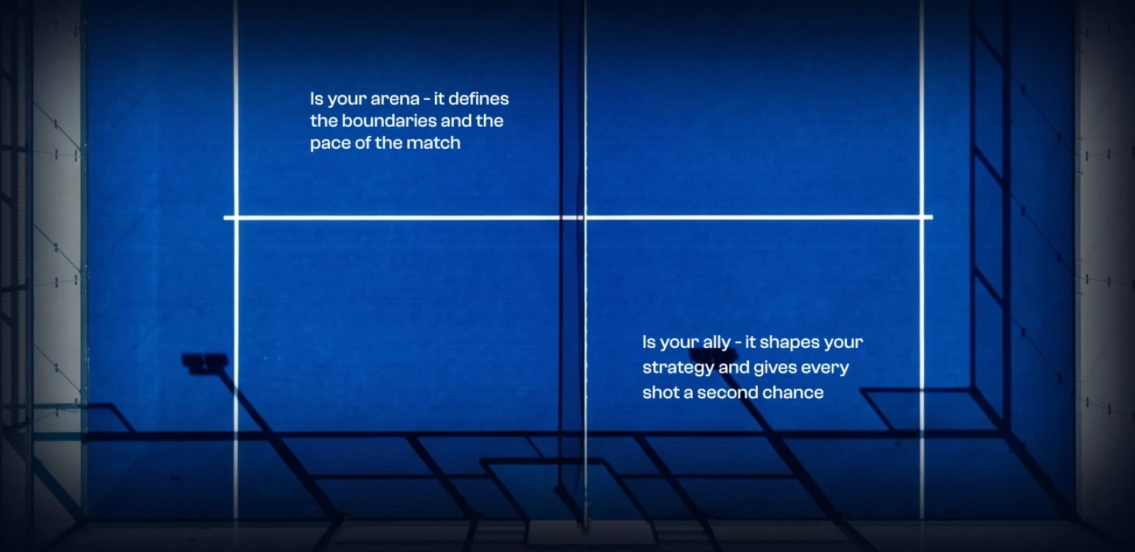
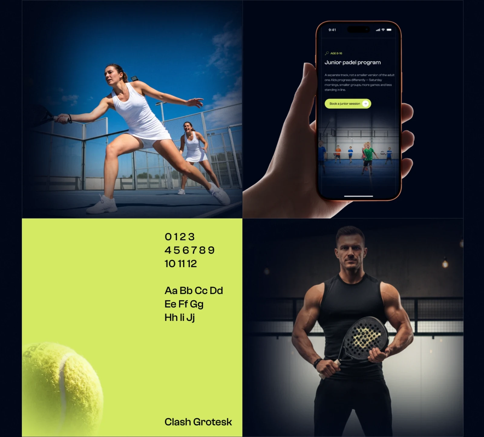
- every graphic motif can be traced back to a real object: the glass wall, the net, the court lines, the perforated racket
- the photos always show a pair or a group of players, never one person, because padel is played in pairs and that is what sets it apart from tennis
- a single acid-lime accent and Clash Grotesk give it energy without turning it into a loud advert
The name fits too. Muro is Spanish for “wall”, the one element that separates padel from every other racket sport.
[04]
The site and the user's path
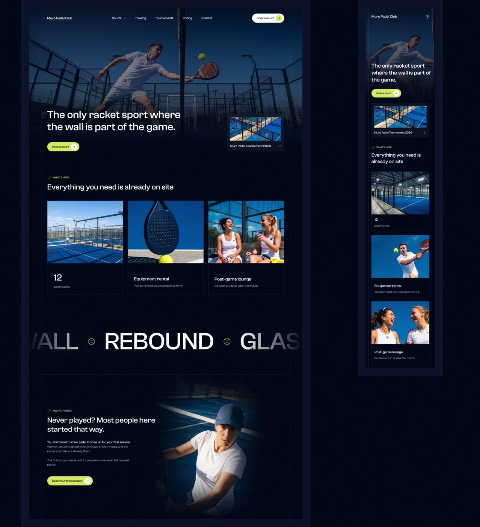
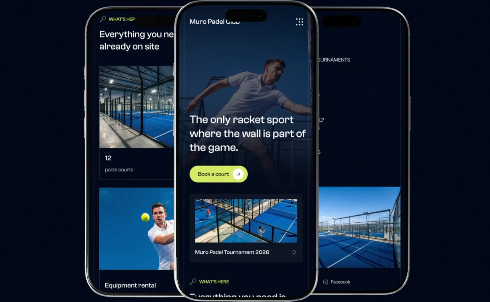
The site leads from what makes padel different all the way to booking a court, with no “about us” section breaking up that path.
The key blocks of the homepage are
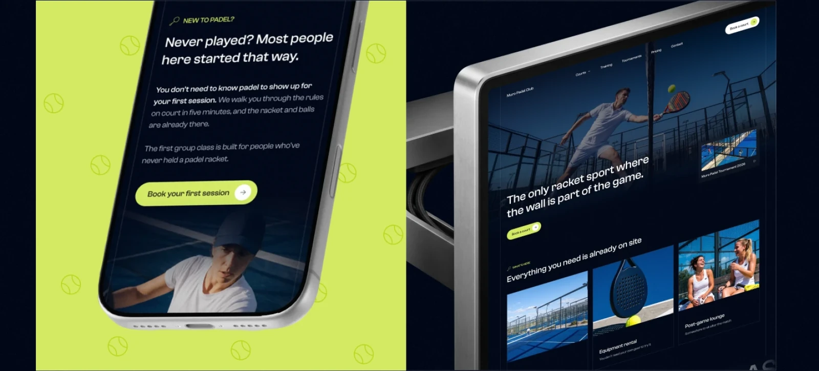
- a hero that opens on how the game works rather than opening hours and an address: “The only racket sport where the wall is part of the game.”
- a “Book a court” button in the navigation and the hero, for people who already know what they want
- a short look at what's on site: twelve courts, equipment rental and a post-game lounge
- a “Never played?” block that answers head-on the worry other clubs tend to leave unsaid
[05]
Coaching, leagues and tournaments
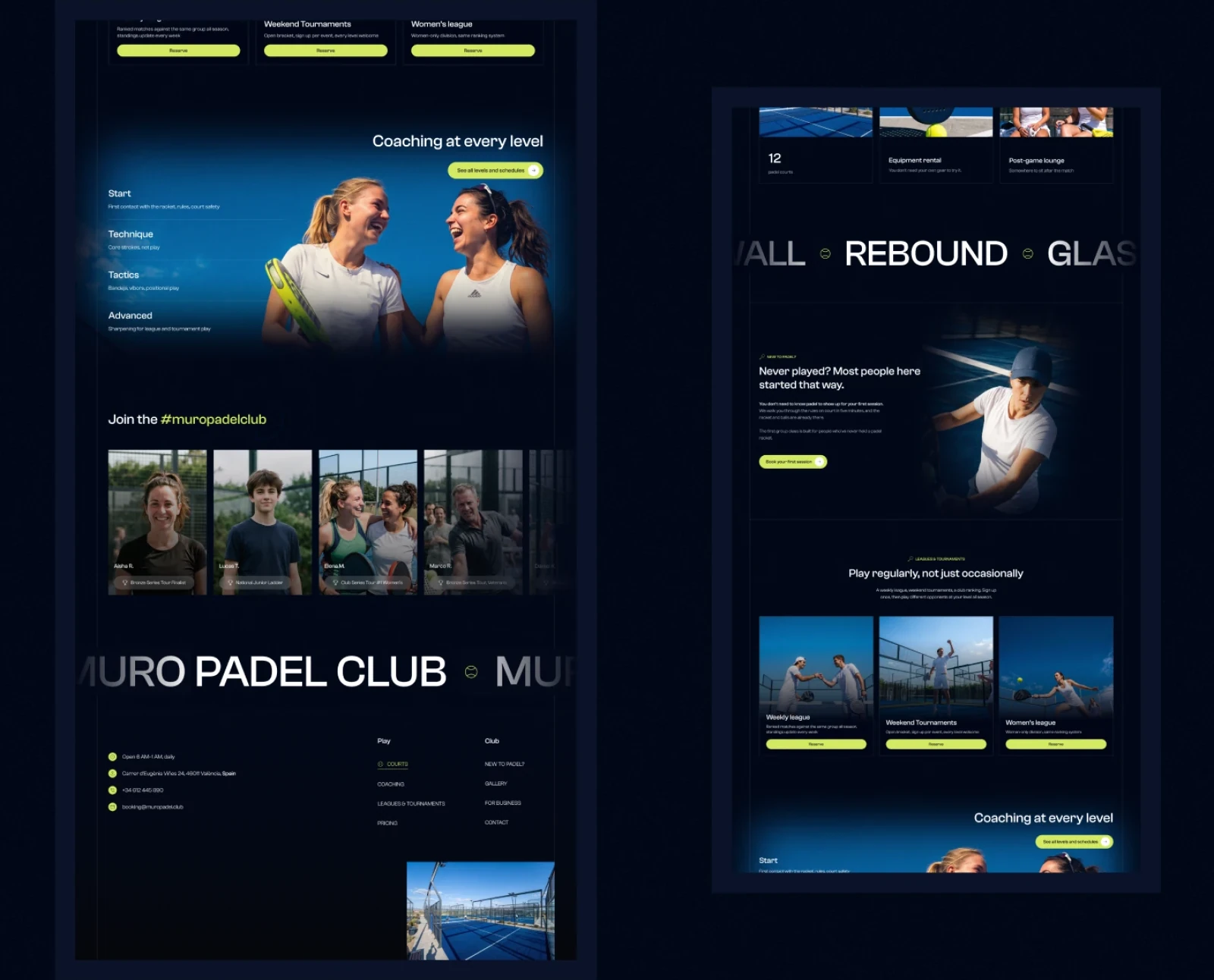
The Coaching and Leagues & Tournaments pages keep the club's training levels apart from the official ladder of the Spanish padel federation.
Instead of asking “what's your level?”, both pages offer four short descriptions, so players recognise themselves and land straight in the right category.
[06]
The result
The result is a consistent site whose look comes from the sport itself rather than a generic “sporty” aesthetic.
The site
- draws its visual identity from the physical elements of padel
- takes a visitor from first impression to a booked court without detours
- speaks to beginners and competitive players at the same time
My part was the visual layer: the direction, palette, typography, graphic motifs and the design of the screens on desktop and mobile.
Next step